.png?height=120&name=rockcontent-branco%20(1).png)
- Rock Content Knowledge Base
- Ion
- Create and Edit
Responsive design
Simplifying breakpoints
Ion offers an improved way to preview your creative content, ensuring it appears just as you intend across various devices.
Preview options while editing
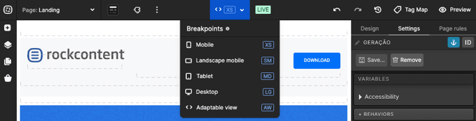
While editing your page, on the top bar, you'll find a single dropdown menu labeled "Breakpoints." This dropdown replaces the previous icons and offers a more streamlined approach to selecting device views:
- XS (Extra Small): Represents mobile Portrait, less than 768 pixels wide;
- SM (Small): Represents mobile Landscape, ranging between 768 pixels and 991 pixels wide;
- MD (Medium): Represents tablet-sized screens, between 992 pixels and 1199 pixels wide;
- LG (Large): Represents screens larger than 1200 pixels;
- AV (Adaptable View): Adjusts based on the browser size for a better fit. Other breakpoints maintain their selected view regardless of the browser page size.
Live preview for accurate assessment
Experience a true-to-life preview by clicking on the Preview option in the top right corner. This live preview opens in a new browser tab and replicates the user's view, allowing you to interact with your content just like a live webpage.
The live preview adapts to the device that opened the link, providing an accurate representation of how users will see your content.
These enhancements aim to simplify your workflow and ensure a seamless experience while fine-tuning your content for different devices.
If you have any questions, please contact us on help@rockcontent.com. 😀