.png?height=120&name=rockcontent-branco%20(1).png)
As part of your ion console setup, we will code one branded theme that can be applied to your ion experiences. Your theme includes brand-approved styling that controls the look and feel of your creative. For example, when you apply your theme to a Quick Start creative, the fonts for that creative will be updated to use your brand-approved fonts, buttons will take on brand-approved colors and your logo will appear in the top left corner of the page.
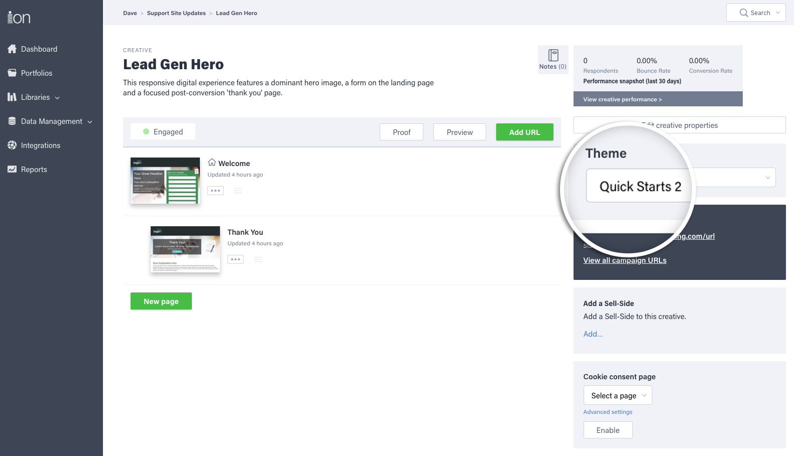
Before editing any creative you download from the Quick Start Cloud, you will want to apply your branded theme to the creative to ensure that it utilizes brand-approved styling that are loaded into your theme. After downloading a Quick Start, you can quickly change the theme by selecting your branded theme from the theme dropdown menu on your creative management screen.
Micro-Themes
Your ion theme comes with tons of micro-themes that allow you to quickly change the style of the content on your page.
By using Micro-Themes, you will be able to create hundreds of on-brand page style combinations using a single theme that is based off of your site’s brand guidelines!
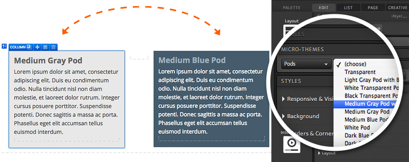
Micro-Themes are content-specific. So, if you’re editing a link, you’ll see Micro-Themes that are specific to styling links. But if you’re editing text, you’ll see Micro-Themes that are specific to styling text.
When editing a container, you can use Micro-Themes to apply variations of styling options built into your theme. This gives you the ultimate control over how your page is styled within the safe and consistent standards built into your branded theme. For instance, you can style any group of links as either your main navigation tabs or as footer links. You can also apply different color and style schemes to your content pods, forms, and other page elements, to create an alternate, on-brand look and feel to your page.
Simply select your container and then click into the Micro-Themes button within your creative studio. Next, select the style category you would like to use (i.e. navigation, pods, buttons, etc.) and then the type of styling you would like to apply to your container.
Here you can see two different Micro-Themes being applied to a container. All of the styling — text colors, background, button, etc. — are different based on the chosen Micro-Theme.
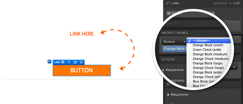
Micro-Themes can also be used for smaller style changes like turning a text link into a button link.
If you’d like a new ion theme with Micro-Theme capability, reach out to your Customer Success Manager to talk about next steps!
*NOTE: If you are working within a theme that has Micro-Themes defined but are not able to find the Micro-Theme option in your creative studio, you may have something selected for which no Micro-Themes are designed. When in doubt, find the container for your content (its row, column, responsive grid, etc.), press the up arrow on your keyboard.
If you have any questions, please contact us on help@rockcontent.com. 😀