.png?height=120&name=rockcontent-branco%20(1).png)
Containers give you ultimate control over the structure of your Ion pages by allowing you to publish as much content as you like into a given area or add grids to your containers in order to customize and define how content is displayed on your page.
You will find a discussion of how containers and grids are organized toward the bottom of this support post.
Containers
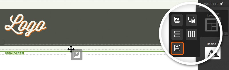
Within the Layout category in your Palette tab, you will find the container icon. Your QuickStart Cloud pages have been built using the base_layout, and already have several containers in place.
If you are using a master page, you can add containers to your page by dragging and dropping the container icon from your Palette tab to the desired location on your page.
After a container has been added to your page, you may drag and drop virtually any other icon into the container to publish as much content as you would like. This includes grids, text, images, links, etc.
Grids
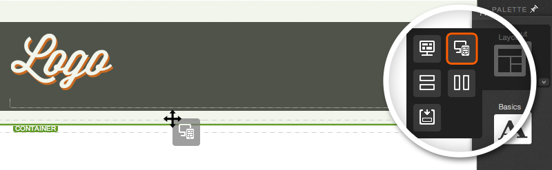
The Layout category in your Palette tab also includes icons that allow you to add a grid to your containers. Grids are used to add columns and rows to your containers, which in turn will help you structure your page however you would like.
There are two types of grids to choose from within the Palette tab - a standard grid and a responsive grid.
The standard grid will have a fixed width, and the responsive grid will allow you to define a grid structure that is flexible and can be altered for varying screen sizes and devices.
Please note that the responsive grid icon is only shown when working in pages built from the base_layout. Your QuickStart Cloud pages have all been built from this layout, and will have the responsive grid icon option available in the palette.
To define a column structure for your container, simply drag the grid icon into a container. By default, your grids will include three columns in a single row. You may publish any type of content into any of the three columns available within your grid by dragging the desired Palette icon into a column within your grid.
Rows & Columns
You can add another row to your grid by dragging the row icon into your grid.

You will also find a column icon in your Palette tab that can be used to add more columns to your row.

Working with Grids
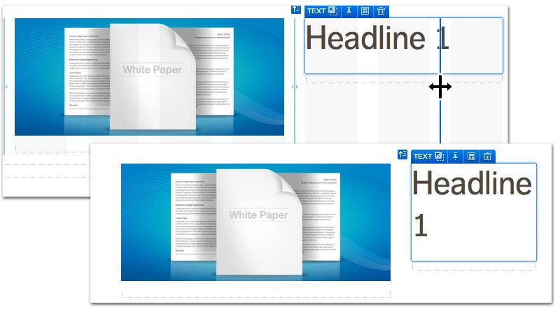
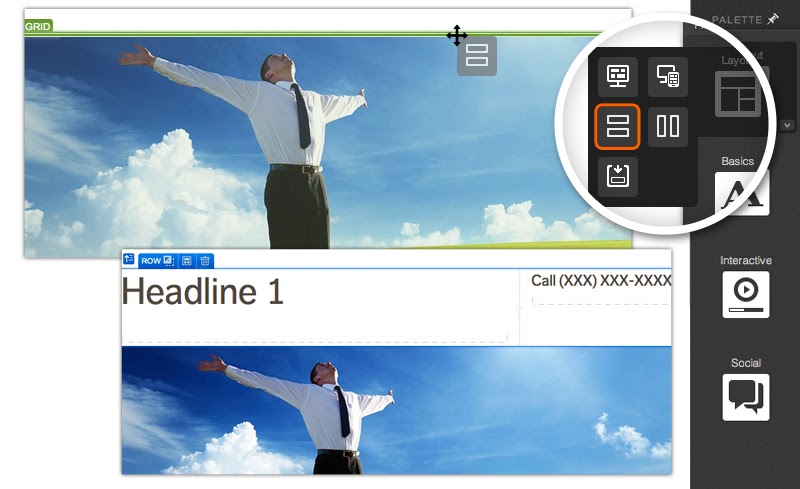
After adding a grid to a container, you will be able to alter the width of your grid columns and also alter the layout of your rows. When hovering over a grid, you will see column borders that you can click and drag in either direction to alter the width of a given column.
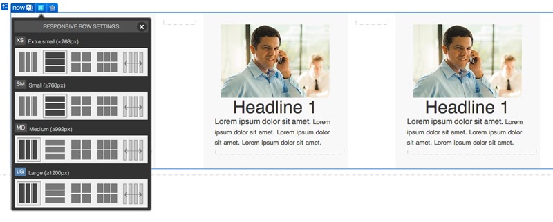
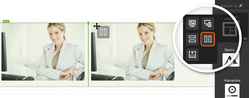
You can also alter how content within a given row is displayed. When editing an element within a given row, the element badge will include a row settings icon that allows you to quickly change the layout of that row. Clicking the row settings icon will open a screen with options to display content horizontally, stack your columns vertically, place your content in a 2x2 grid, a 3x3 grid and also an option to simply distribute your columns evenly horizontally. The “distributed” option is a great option for instances where you add columns to your grid and want them all to be the same width.
Hierarchy of Containers
Containers are your highest level editor into which all content is published. When working within a container, you may add anything from your Palette tab including text, images, links, etc.
Grids are published into containers as well. If you are working in a Quick Start creative, responsive grids will have already been placed inside of containers. If you are looking to add a new grid to your page, you will want to publish it into a container.
By default, your grids will include three columns in a single row. You may add more columns to a grid by dragging the column icon from your Palette tab into your grid.
You may also add rows to your grid by dragging the row icon from your Palette tab into your grid.
You will find blue badges at the top left of the element you are editing. These badges are a great way to review the hierarchy of the element you are working on. You may use the hierarchy icon (far left, up arrow) to quickly navigate to a higher element. For example, if you are editing an image within a column, hovering over the hierarchy icon will allow you to select either the column, row or the entire grid that the image is in. Remember, grids contain rows; rows contain columns; and columns contain content.

*NOTE: The new Base Layout master page includes one container by default. If you are working on a master page and want to add a grid, drag the grid (or responsive grid) into the base container. Other master pages may not include a container. You may drag containers into master pages and subsequently add grids to those containers.
Please also note that the responsive grid icon will not be available within master pages but rather will only be available for the base_layout used by QuickStart Cloud creatives, and when building a creative from scratch.
If you have any questions, please contact us on help@rockcontent.com. 😀