.png?height=120&name=rockcontent-branco%20(1).png)
The Flow component allows you to publish any type of content you would like and gives you the option to add as many steps as you would like and also more styling options for the progress indicator and transition effects.
The Flow component can be used to move content across a targeted area of your page without changing pages.
Let’s Get Started
To start using the Flow component, simply drag the Flow icon into any container on your page. Once in place, you will see three steps available for the Flow component by default with a progress indicator to show visitors what step they are on within the Flow. You can use the Flow variables to enable or disable these navigation steps, set up auto-play for your Flow steps to rotate, looping to allow the Flow to rotate from the last step to the first step (and vice versa), fix the height and also if you would want the page to scroll to the top after each step change.
To add more steps to the Flow component, simply drag the Flow Step icon into your Flow component.
Each flow step will include a container that you can publish any type of content from your Palette tab into (i.e. grids, containers, images, other ready-made components, etc.). You can also use the flow step variable available to apply a tag to that step.
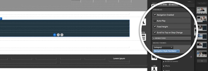
Variables
Through variables you can define some rules for your Flow. With Flow selected in your creative, select the desired items:
-
Navigation Enabled: Clickable and/or swipeable navigation
- Auto-play: Automatically advances to the next Flow Step after a set delay. This Flow's Auto-Play setting allows users to change the speed of the Flow Steps. After selecting this option, you can choose the transition time in seconds in the Auto-play Delay box.
.png?width=334&name=Beach-Landing-Creative-Studio%20(3).png)
With Auto-Play selected, you can also check the "Stop Auto-Play on Navigation" option, so that stops Auto-Play after the user navigates by click or swipe.
- Looping: Allows Flow to cycle between first and last steps.
- Fixed Height: Flow will match the height of the tallest Flow Step.
- Scroll to Top on Step Change: Automatically scrolls to the top of Flow after a Step change.
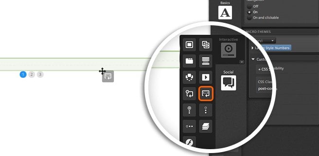
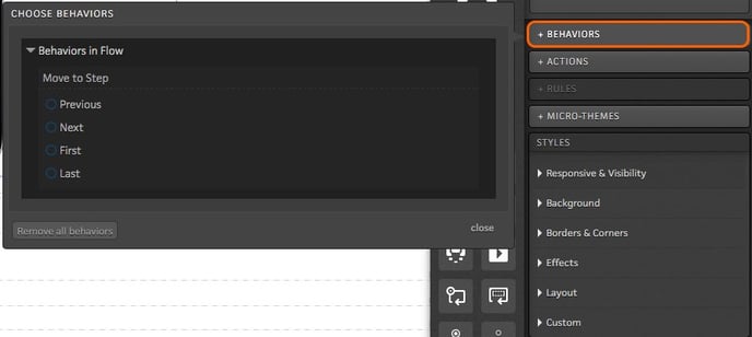
Behaviors
When editing any clickable element within the Flow, you will see the option to define a “behavior.” Behaviors allow you to define an action for a given element within your Flow. For example, if you want a link or an image to take respondents to the next step when clicked, you would define this as a behavior for that element. To set a behavior, simply click the “Behaviors” button when editing your content.
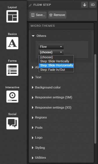
Micro-Theme Styling
The styling of your Flow component can be adjusted by applying micro-themes. Flow micro-themes can be used to adjust the position of your progress indicator, transition effects as well as the style of the progress indicator. The transition effects can be set to the entire Flow component at once, or you may set a different transition for each step.
Micro-themes can also be used to control whether content goes left to right, up and down, or if you would simply want content to fade in and out.
If you have any questions, please contact us on help@rockcontent.com. 😀