.png?height=120&name=rockcontent-branco%20(1).png)
The most commonly used field in a form is a textbox. To add a textbox to your custom form, simply drag the textbox icon into your custom form container.
Field Labels
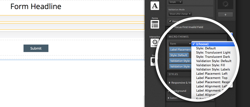
Your textbox will include a textbox at the top of the field by default. You can double click the label to edit it as needed. The position of your label can be modified with a micro-theme. With your form container selected, you will see the option for label positioning within the “Form” micro-theme category.
The field label can also be removed altogether if you would prefer to use placeholder text for the textbox.
Input Types
After you pull a textbox into your form, you will want to select an input type. The input type controls the formatting of your textbox. When viewed on a mobile device, the input type options allow specific keyboards to be presented to visitors when they select a given textbox. The six input type options are:
-
Text - allows anything to be entered into the textbox
-
Multi-line Text - a larger textbox will be presented to respondents which in turn gives them an opportunity for a longer response (i.e. comments field)
-
Number - only allows numeric values to be submitted
-
Email - only allows email addresses to be submitted
-
Phone Number - only allows phone numbers to be submitted
-
Date - only accepts dates to be submitted and will give visitors a calendar to choose a specific date from
-
Password - text will be hidden while respondents enter password into textbox
Required Fields
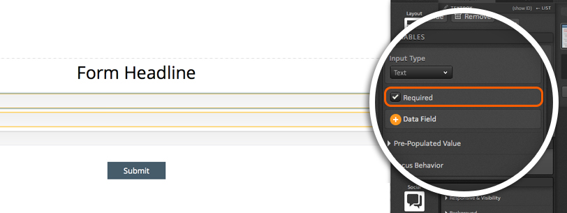
You can make the textboxes in your custom form required like you would within your Form Library. To make a given textbox a required field, simply check the Required checkbox.
Data Field
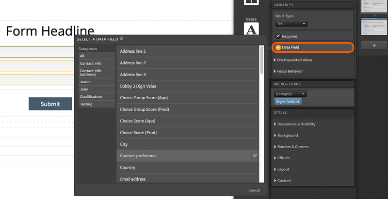
Next, you will want to apply a data field to your textbox so that data is saved to the platform. To assign a data field your textbox, click the Data field button to open a flyout. From here, select the data field category and data field from the flyout to save data from the textbox to that field.
Pre-populated Value
You can set default values and add placeholder text to your textboxes too! As a first step, you will want to define the initial value using the available dropdown. Within the initial value dropdown, you will find three options.
-
Respondent data or default value - pre-populates textbox with data that was entered during a previous visit to the page or, if none is available, displays a custom default value
-
Default value - pre-populates textbox with an initial value that is manually set within your creative studio
-
No value - data will not pre-populate textbox
*Note: If you use one of the first two options listed above, you will see a button available to add a custom initial value. To manually set an initial value that will always be displayed to visitors, simply click this button and enter the desired initial value.
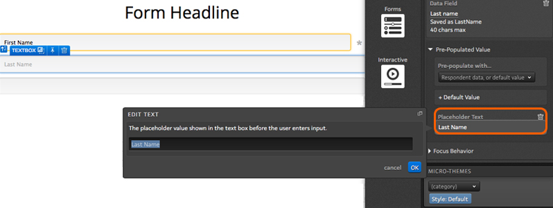
Within the Pre-populated value section, you will also find the option to add placeholder text. Unlike the initial value option, this would not be used to save data to the textbox. Instead, this would allow you to display a field label inside of your textbox that would automatically be removed when a respondent clicks into the textbox.
Focus Behavior
Within the focus behavior section, you will find two options.
Auto-focus - when enabled, the visitor’s cursor will automatically be placed inside this textbox on page load
Select text on focus - when enabled, visitors who click into the textbox will automatically highlight the initial value so that when they start typing, it will overwrite the initial value
If you have any questions, please contact us on help@rockcontent.com. 😀