.png?height=120&name=rockcontent-branco%20(1).png)
Did you ever have some difficulty adjusting the display of content for mobile? This article will provide tips and tricks on how to do that.
Using Micro-Themes:
There are two Micro-Theme categories to help with publishing adjustments for SM and XS viewports specifically. These can be found under the “Responsive Settings – SM” and “Responsive Settings – XS” dropdowns in the Micro-Themes.
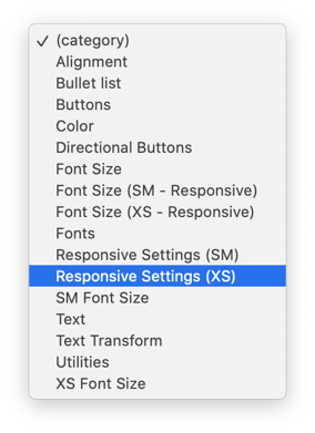
Inside these two categories, there are a variety of commonly needed adjustments to apply. These Micro-Themes will ONLY apply to the SM or XS viewports.
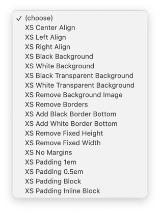
- Center Align
- Align the content to center
- Left Align
- Align the content to left
- Right Align
- Align the content to the right
- Black Background
- Override the background and make it black
- White Background
- Override the background and make it white
- Black Transparent Background
- Override the background and make it a transparent black
- White Transparent Background
- Override the background and make it a transparent white
- Remove Background Image
- Remove the background image
- Remove Borders
- Remove all borders
- Add Black Border Bottom
- Add a black border to the bottom
- Add White Border Bottom
- Add a white border to the bottom
- Remove Fixed Height
- Remove any “height” property that has been set
- Remove Fixed Width
- Remove any “width” property that has been set
- No Margins
- Remove all margins
- Padding 1em
- Override padding properties and set all padding (top, right, bottom, left) to 1em
- Padding 0.5em
- Override padding properties and set all padding (top, right, bottom, left) to 0.5em
- Padding Block
- Override the “display” property and set it to block
- Padding Inline Block
- Override the “display” property and set it to inline-block
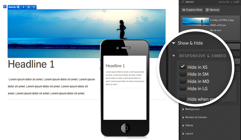
Using Show & Hide:
When editing a responsive page, you will also have Show & Hide styling options to show/hide certain elements for certain screen sizes. When deciding to hide a given element, simply select the element and the screen size for which you would like to hide it. Below are the keys of what type of device each size typically corresponds to:
- XS = Portrait Mobile
- SM = Landscape Mobile
- MD = Tablet
-
LG = Desktop
So if you would like to hide an image when viewing a given page on a mobile device, you would select the image and check the "Hide in XS" checkbox in order for it not render when the page is viewed on a mobile device. Click here to learn more about how to Show & Hide Conditions and Embeds.
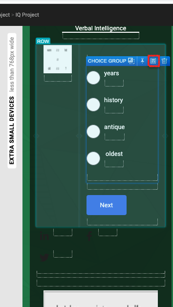
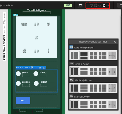
Using "Responsive Row Settings":
This is a very important feature to adjust fields for different views, and each setting won't reflect the look on other views. It will give the fields the ability to either be "Stacked" or "Halves" or "Thirds" or to be "Distributed Evenly".
This setting can be easily accessed by first making sure you selected the correct hierarchy that you would want to adjust for mobile (XS view), then clicking on the "Responsive Raw Setting" icon on the blue top tab of it:
It will open the small window where you will be able to choose how you want it to be displayed in different views:
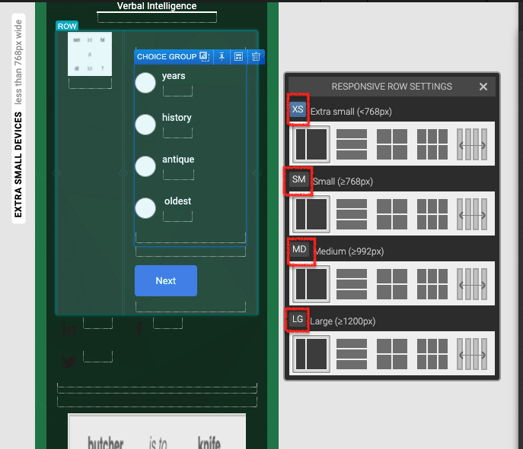
Note: you will want to double-check if you are in the correct device viewport while applying the "Responsive Row Settings" to see how it looks in that view:
If you have any questions, please contact us on help@rockcontent.com. 😀