.png?height=120&name=rockcontent-branco%20(1).png)
When creating and editing pages in your ion console, you will see the creative studio editing area on the right side of the page. This is where you add or edit the content on your page.
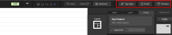
Top Bar
At the top of your creative studio, you will see a bar of buttons with key functionality to navigate, edit and proof your creative.
On the left side of your top bar you will find navigation links that can be used to quickly jump back to the creative, campaign or portfolio in which this creative was made.

The right side of your top bar provides a status of the current page and quick access to common operations.
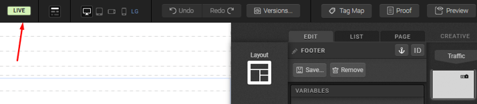
From left to right, the first icon is the Live indicator. If you added a URL to your creative, you will see the Live indicator here. If no URL has been added, you will not see the Live indicator.
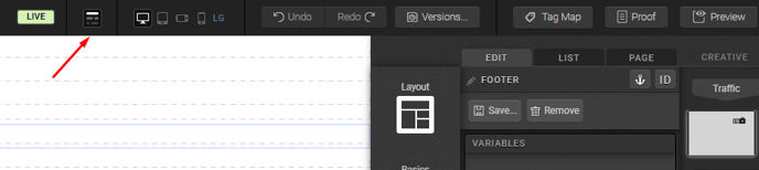
The next icon allows you to toggle between showing and hiding your containers.
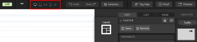
The next four icons allow you to view and publish your page within the LG, MD, SM and XS viewports. This is especially helpful when publishing pages that will receive traffic from many different types of devices. These viewports are represented by monitor, tablet, landscape phone and portrait phone icons, respectively.
Next, you will see the undo and redo buttons, which you can use to undo and redo changes made to the page.
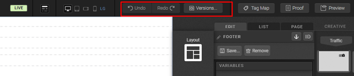
Your status bar also allows you to open the creative proof and a live preview of the page in another tab.
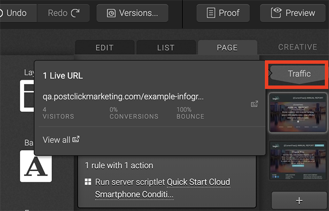
Traffic
The Traffic button can be used to show what URLs were added to your creative. Simply click the Traffic button to see your creative's URLs. You can also click the links within the Traffic button to go directly to the corresponding URL Management screen.
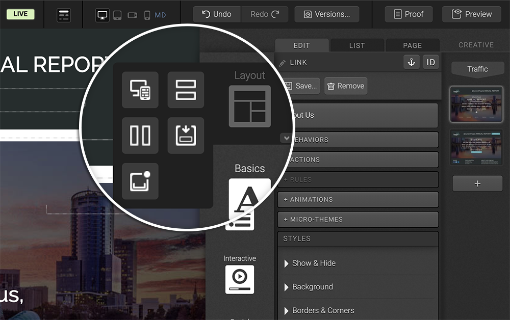
Palette Tab
Your Palette tab is where you will find icons for adding content to your page. These icons are organized into easily identifiable categories for editing. You will find the editing icons by hovering over a given category. You will also find an arrow in the lower right-hand corner of each category icon when you’re hovering that can be used to pin the icons to your Palette tab for quicker access. Simply find the icon you want to work with and drag it onto your page to start editing!
Layout
The Layout category includes icons for updating the structure of your page. This is where you will find the responsive grid that can be added to any container. Grids are used to add a column structure to your page into which you can publish content. The Layout category also includes icons that can be used to add additional rows or columns to your grids. You will also find a container icon at the bottom of the Layout category in case you need to add a container to your page to get started with grids.
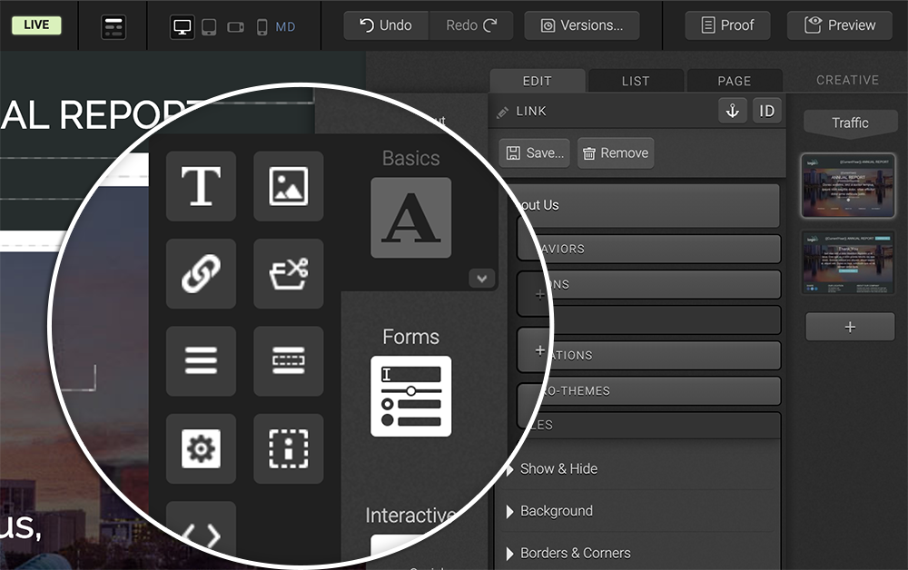
Basics
The Basics Palette category contains icons to add text, images, links, an HTML code block and an iFrame.
Interactive
The Interactive category includes components that were built based on common functionality requests for the ion platform including tabbed content, accordions, rotating images/content, layered content, lightboxes, video, custom widgets (from your Widget Library) and Flash (from your Flash Library).
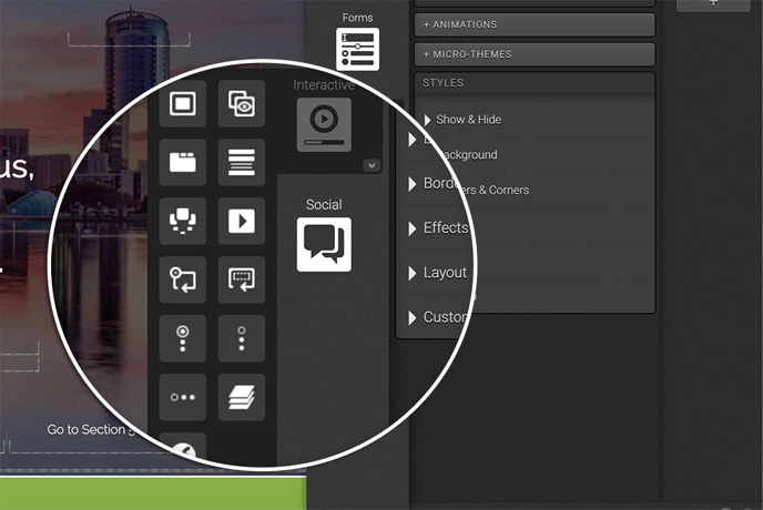
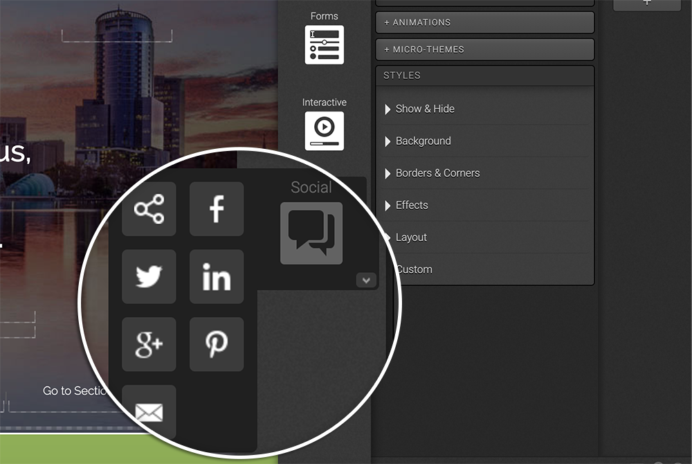
Social
The Social Category is where you will find common social marketing components like a Facebook Like button, Twitter Tweet and much more.
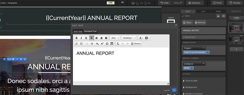
Edit Tab
The Edit tab is where you edit your elements. When you click an element on your page, the Edit tab will present options to edit that element. Double clicking a given element will open a fly-out editor to directly edit that element. You can also remove an element or save creative-wide directly from within the Edit tab.
Text - just click and edit
To edit text, double click the text to open the fly-out editor, make the update and the change will be immediately reflected on the page. By clicking on the CSS button on the Edit tab, you can optionally add inline CSS as well.
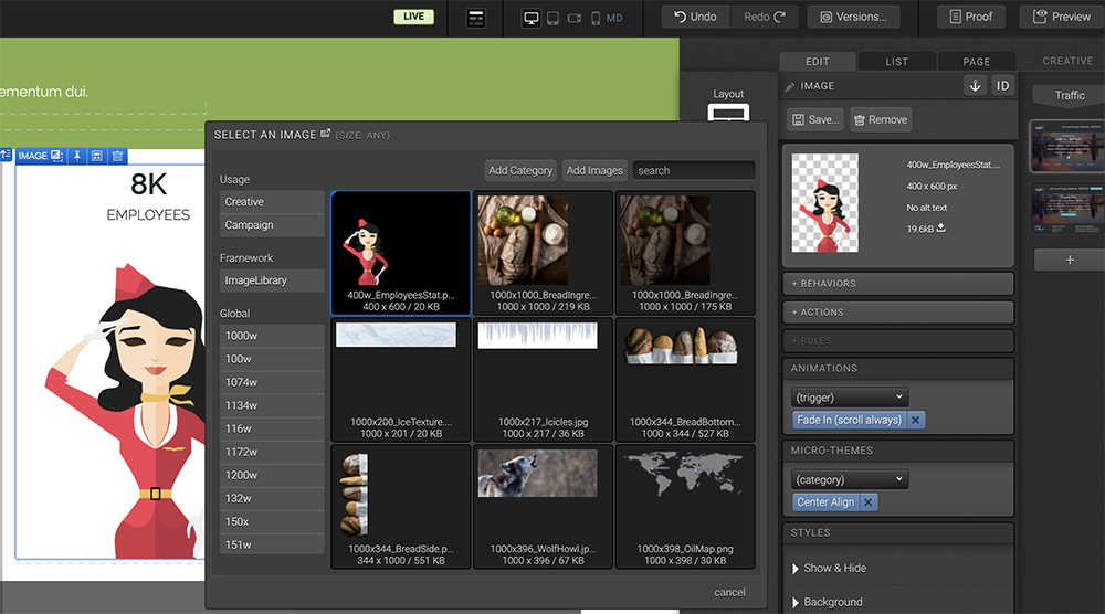
Images - upload directly from your page
After double-clicking an image, you will see the image library. From here, you can search for a given image or browse categories to choose an image from a specific image category.
To add a new image, you can upload it directly within the image editor! Simply drag and drop your images from your desktop into the fly-out image editor to use that image on your page.
Once your image is placed on the page, you can also use the available actions, advanced rules and inline CSS editors that are available within the Edit tab to make your image clickable, apply conditional logic and/or override the default style attributes using inline CSS.
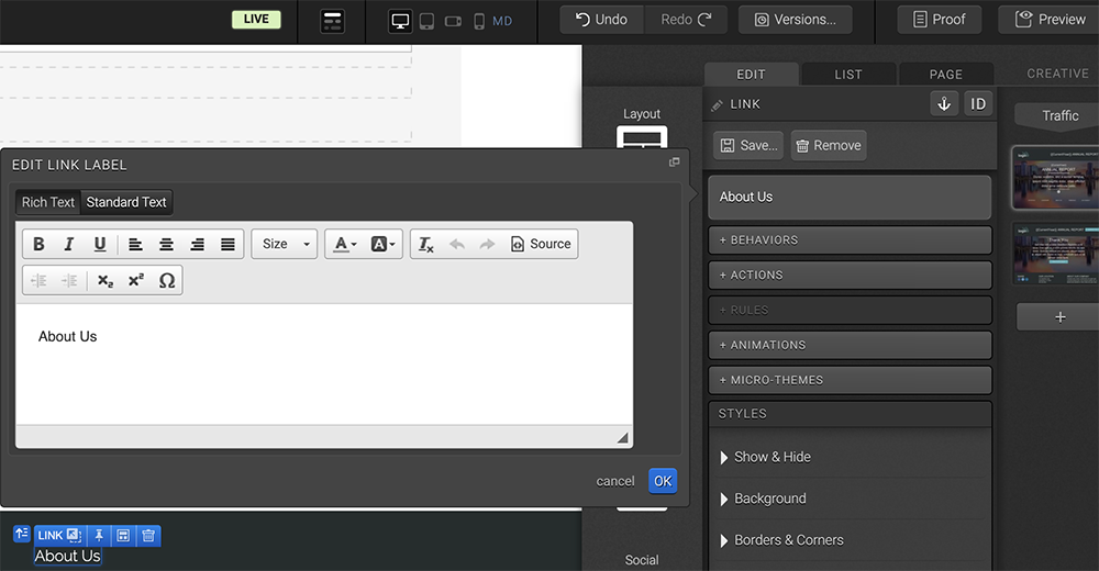
Links
When you double-click a link to open the editor, the link label editor will fly out. From here, enter the text you would like to use for your link and click OK. You will then be able to use the additional editors in the Edit tab to apply the link action, advanced rules and inline CSS.
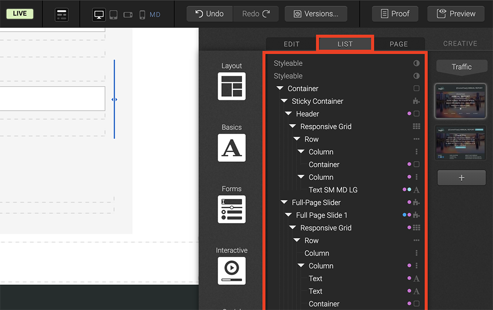
List Tab
The List tab will show you all the elements being used on your page. The elements listed in the List tab are grouped together by the containers into which they have been published. When moving your mouse through the List of elements, you will see a blue highlight around the elements within a given container.
You can double-click a given element in the List to edit the element accordingly in your Edit tab. You can also click and drag elements within your List tab to move them on your page.
You will also notice icons to the right of each of your elements in the List tab. These icons are used to identify what has been applied to a given element as well as the element type. For instance, a piece of text with a micro-theme applied to it will have a purple circle and an A icon next to it. You can see a color key for the circles by hovering over one of them.
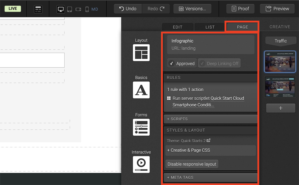
Page Tab
The Page tab shows key information like the title of the page you are currently viewing as well as the status of the page (whether approved or unapproved). The Page tab also shows all the page level rules and scripts. Simply click the RULES button to open the page rules editor where you can add or edit rules that execute on page load. You can also add page-level scripts by clicking the + SCRIPTS button.
Meta tags are also added in the Page tab, which can be configured by clicking the + META TAGS section. You will also find layout and theme information at the bottom of the Page tab.
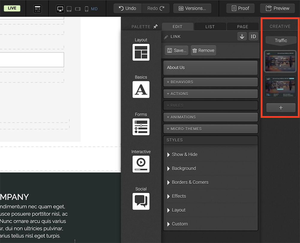
Creative Tab
Your Creative tab shows you a thumbnail of every page within the creative. To edit a different page within the creative, simply click the thumbnail of another page to start editing that page! You can also add another page to the creative by clicking the plus sign at the base of the thumbnails.
If you have any questions, please contact us on help@rockcontent.com. 😀