.png?height=120&name=rockcontent-branco%20(1).png)
When working with forms, you likely have added checkboxes or radio buttons to it. You can add checkboxes and radio buttons to your custom forms too!
Let’s get started
To begin, drag the Choice Group icon into your custom form.
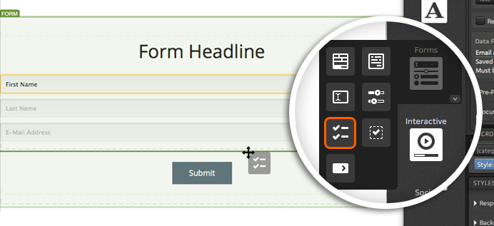
With your Choice Group in place, you will see a few options available within your creative studio.
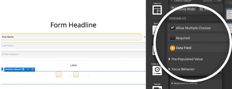
The first option is to allow visitors to select multiple choices. This option is typically used when presenting visitors with checkboxes. If you are going to turn your Choice Group into radio buttons, you will likely want to uncheck this box.
Next, you will see the option to make this a required field. If you want to ensure respondents select one of your choices, you will want to check this box.
Below the Required checkbox, you will see an option to assign a data field to the Choice Group. This is a very important step as a data field must be defined to properly save which choice(s) respondents are selecting. To assign a data field to your Choice Group, simply click the “+ Data field” button and select the desired field from the flyout.
Finally, you will want to choose an option for the pre-populated value from the available drop down menu. Here you will leave two options:
-
Respondent data or choice defaults shows the selection(s) a given respondent selected during a previous visit.
-
Choice defaults will show the default state that you have set up for each choice regardless of anything that may have been selected during a previous visit.
Choices
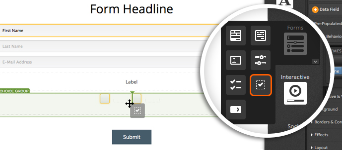
After your choice group variables are set up, you will want to first ensure that you have enough Choices within the group.
By default, your Choice Group will include two Choices. You can remove choices by selecting a given choice and then clicking the remove icon within your creative studio.
You can add more Choices to the group by dragging the Choice icon into your group.
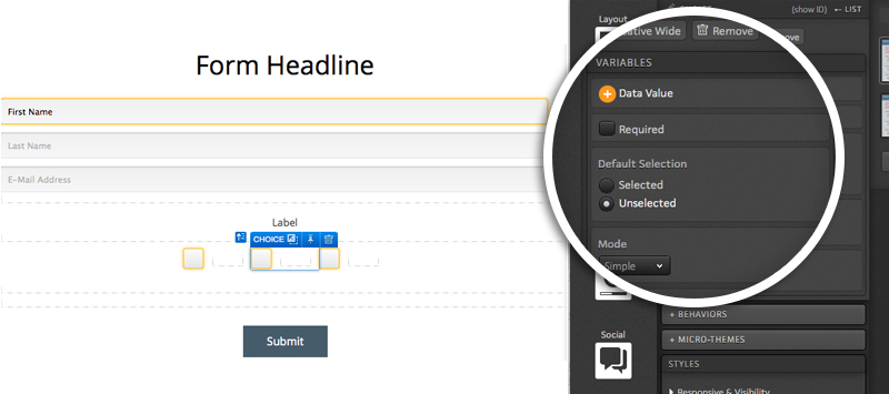
When editing a Choice, you will want to ensure that a data value is applied. You will see a button in your Creative Studio available for applying a value when editing a Choice. The value entered here is what will be saved to the platform when this Choice is selected.
Also in your Creative Studio, you will see a checkbox to make this specific Choice within the group required for form submission.
Next, you will see an option to make your choice selected or unselected by default when visitors land on the page.
Your Choices also have two modes that can be used - simple and expanded. Simple mode will show any content you publish into a given Choice’s container.
If you switch over to the expanded mode, you will have two containers to publish content into for your Choice. The first container is what will be shown to visitors when the page loads. Content published into the second container will be displayed when that Choice is selected. This gives you the ability to apply your own custom on-state to your choices!
Adding Content
When you drag the Choice Group icon into your custom form, you will now see two checkboxes in place by default with containers next to them.
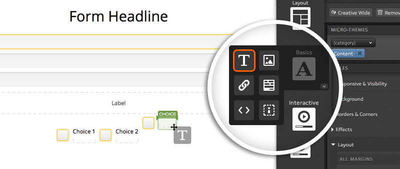
If you want to have text next to each choice, simply drag your text editor icon into the choice container.
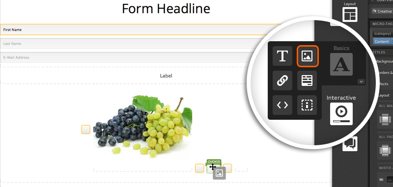
If you would like to place an image next to your choices, you can absolutely do that too!
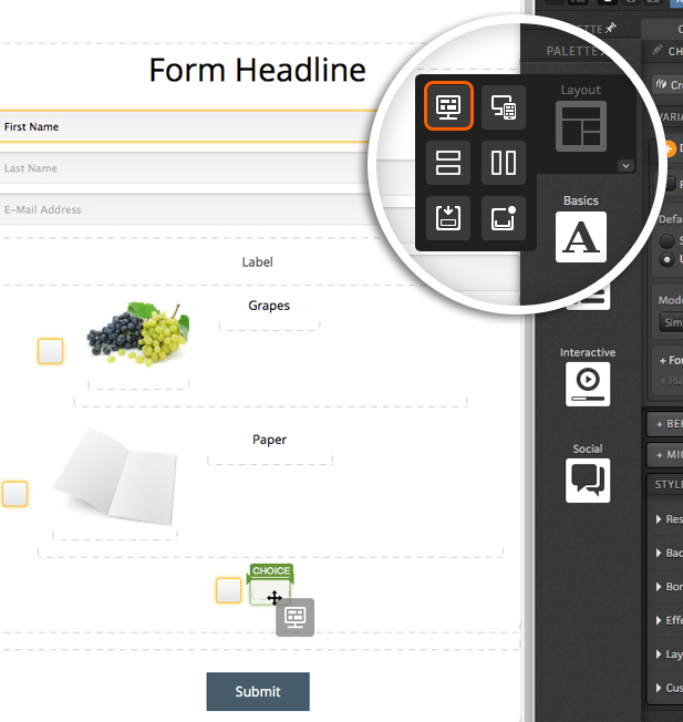
You can even add grids to your Choices for even more control over how content is displayed within your Choices!
If you have any questions, please contact us on help@rockcontent.com. 😀