.png?height=120&name=rockcontent-branco%20(1).png)
Creative-level and Page-level CSS support gives you quick and easy access to the CSS of a page.
This allows you to quickly alter the styling of any elements on your page without adjusting the actual theme code. You can even add your own micro-themes here! This is great for style updates that you want to make to a specific page or creative but not to all creatives using that theme. You will even be able to see your CSS changes directly on your page while editing!
To edit the creative or page's CSS, simply click the Creative & Page CSS button in your Page tab and enter your CSS into the available flyout.
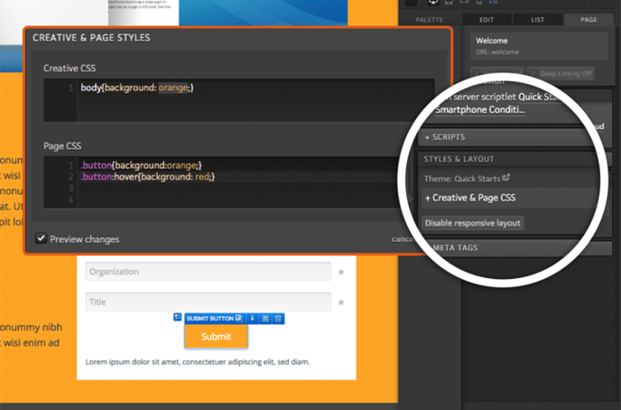

Creative CSS
Creative CSS styling will be applied across all pages within your creative. If you edit this on one page within your creative, it will apply immediately to all other pages.
Creative CSS is useful when you have an element that may not need to be a part of your theme. For example, a button color change that you don't want to be applied to any other creatives, but want to use in this creative.
You can also utilize the ion platform-specific tags to define a micro-theme that is only available on that Creative or Page. Once you save, a page refresh will occur and you will be able to instantly utilize the new micro-theme.
Page CSS
Page CSS will only apply to the current page you are in in your creative. If you make edits to the Page CSS, it will only be saved and applied to that page.
Page CSS is helpful to apply page-specific CSS like changing the height of an element that appears on each page.
Media Queries
Another great use case for Creative and Page CSS is to change styling using a CSS media query for different viewports instead of showing and hiding multiple versions of a given element.
For example, there might be times when you want to make <h1> headlines a different size in the XS viewport without showing and hiding different versions of that headline. A media query can be added to the Creative or Page CSS editor to change the size for the XS viewport (767 px wide and smaller). Below, please find an example of a media query that can be used to make <h1> headlines 1.2 em in the XS viewport:
@media screen and (max-width: 767px) {
h1 {font-size: 1.2em;}
}
Here is a set up of media queries based on the 4 defined sizes in the ion platform of Large, Medium, Small, and Extra-Small:
/*MEDIUM SCREENS*/
@media screen and (max-width: 1199px) {
}
/*SMALL SCREENS*/
@media screen and (max-width: 991px) {
}
/*EXTRA SMALL SCREENS*/
@media screen and (max-width: 767px) {
}
If you have any questions, please contact us on help@rockcontent.com. 😀