.png?height=120&name=rockcontent-branco%20(1).png)
The Reveal component can be used to show and hide content by simply hovering over or clicking a given element.
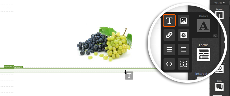
For example, if you would like to display a caption when visitors hover over an image, you can use the reveal component.
When you drag the Reveal component into your page, you will be given two containers.
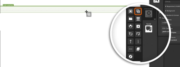
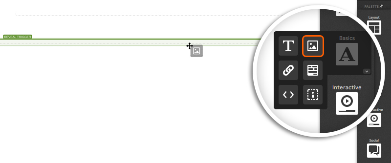
The “Reveal Trigger” will be the first container. Simply drag any content you would like into this container and it will be what respondents see when they land on the page.
The “Reveal Container” will be the second container. This is where you will pull in content that you would like to show when respondents hover over or click the Reveal Trigger element.
Reveal Settings
When editing your Reveal component, you will see the below options:
Reveal type
-
Overlay - displays Reveal Container content over the top of Reveal Trigger
-
Toggle - displays Reveal Container content instead of Reveal Trigger
Reveals when
-
Hovered - display Reveal Container when respondent hovers over Reveal Trigger
-
Clicked - display Reveal Container when respondent clicks Reveal Trigger
Position
- Provides options for where Reveal Container should be displayed. If manual is selected, it will be displayed where it is published on your page.

Tips & Tricks
If you seem to be having an issue with the Reveal component in your Safari browser when using flip transitions on more than one object on a page, simply add the micro-theme for Utilities > Animation Wrapper to the container holding the reveals to resolve.
Remember that the Reveal component doesn't add extra space to a page, it just replaces the content inside the Reveal trigger. This is why it's not possible to vary the height while showing a reveal component.
If you have any questions, please contact us on help@rockcontent.com. 😀