.png?height=120&name=rockcontent-branco%20(1).png)
To help you find success on your first project (and beyond) we’ve created this handy playbook of the most important information you need to know before you start designing for Visually. From the nuts and bolts of designing for clients to the best practices for successful communication, this guide will give you the background, tools, and insights you need to succeed on the Platform. Please bookmark it and refer back as often as you need to. And please always feel free to reach out directly if you have any questions. It is our goal to help you build a stellar reputation on the platform, so we can build a great working relationship, together.
Table of contents
10 Things to Know as a Visually Designer
- Invites
- Creative discovery process
- Making recommendations
- Scope, creep & add-ons
- Illustration styles
- Stock imagery/assets
- Fonts & type faces
- Firstdraft
- Working with client feedback
- Timelines and deadlines
- Anatomy of a Visually project team
- Working well with Visually team members: A checklist
- Working well with Visually clients: A checklist
- Communications
Visually Platform: The mechanics
- Visually process overview
- Interpreting the creative brief
- The kick-off call
- Presenting your work
- Prepping and organizing your files
- Infographics
- eBooks
- eBookstemplate
- Presentation
- Presentationtemplate
- Social content
- Social content template
- Iconography, UI
- Iconography, symbol
- Logo
- Styleguide
- Creative Director add-on
- Illustration add-on and style
Your relationship with Visually
- Reassignment
- Decertification
- Tools and resources
Welcome
To help you achieve success on your first project (and beyond) we’ve created this handy playbook of the most important information you need to know before you start designing for Visually. From the nuts and bolts of designing for clients to the best practices for successful communication, this guide will give you the background, tools, and insights you need to succeed on the Platform. Please bookmark it and refer back to it as often as you need to. And please always feel free to reach out directly if you have any questions. It is our goal to help you build a stellar reputation on the platform, so we can build a great working relationship, together.
At Visually, you’ll be working directly with high-profile clients and other certified team members. As the designer, you are responsible for creating the visual language and design for our clients. You’ll need to be a clear communicator, detail-oriented, and pixel perfect in everything you do. And you’ll always need to deliver on time and on budget.
REQUIREMENTS/SKILLS
-
Executing animated videos that help clients meet their objectives
-
Comfortable working with and interpreting specification documents (e.g., creative briefs, scope of work (SOW), etc.)
- Experience with animation in any (or several) of our core products; editing live action footage and other areas of focus are a plus
- Strong experience working in Photshop, Illustrator, InDesign or other relevant tools
-
Comfortable working within an online project management platform
-
Active interest in animation (it’s not just your job, it’s your passion)
-
Focus on both macro- and micro-level design details
-
An eye for jump frames, floaty motion, or other errors that can ruin a great
video
-
Ability to give and take constructive feedback
- Clear and professional communication skills, both written and verbal. Comfortable joining conference calls with clients is a plus and is sometimes required
10 things to know as Visually designer
1. INVITES
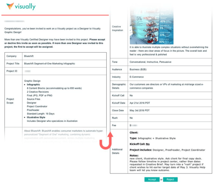
Project invites are sent via email. They include important details about the project like the project background, estimated timeline, scope, and fee. At the end of the email, you’ll have the option to accept or reject the project. For every project, Visually extends an invite to several designers at one time. The designer who is first to respond is typically assigned. It’s important to make sure that you can see the project through to completion. Please be sure to read all the invite details and requirements closely. If you’re unable to meet the requirements, we may have to reassign the project to a different designer. Reassignments (based on performance) negatively impact your Visually rating, making you less likely to receive project invites in the future.
Please don’t be discouraged if you don’t get assigned a project that you’ve accepted; we welcome you to try again! Our goal is to assign projects as quickly as possible – usually in less than 12 hours – which means we move quickly.
2. CREATIVE DISCOVERY PROCESS
Two of the values of the Visually Platform are transparency and talent empowerment: we strip away the layers of traditional red tape to allow designers to interact directly with clients to maximize efficiency and creativity. This means you are empowered to make the project successful through thoughtful discovery, on-point execution and collaboration with the client. While a creative director, project coordinator or a creative brief may provide you with some project insight and information, you must not rely on any one person or document to achieve a clear picture of the project. Leverage your intuition, the checklists in this document, and client-provided resources as guides to facilitate a conversation around the project with your client. Along with the provided information in your scope and creative brief, we recommend confirming any additional information to make your understanding of the project and deliverables more robust.
3. MAKING RECOMMENDATIONS
Not all clients know what they want, and that’s OK. That is why you are there to help guide them. Based on your project brief, documents, client-provided inspiration, and responses to any of your discovery questions, you should be able to provide initial recommendations to your client after your introduction or kick-off call, and be able to gather consensus on the following:
- Guiding concept and direction
- Color palette
- Typography
- Layout, hierarchy and groupings
- General style or visual language
- Illustration direction (if part of the scope of work)
4. SCOPE, CREEP & ADD-ONS
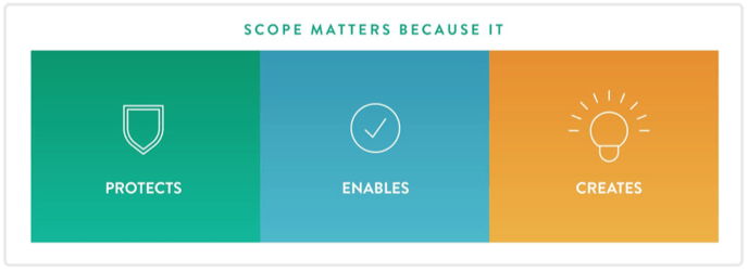
Thoroughly understanding your project scope is the best way you can provide value to Visually and your client, and ensure you get paid for all of your efforts. Your project scope will detail all deliverable expectations so that all parties are on the same page.
SCOPE MATTERS BECAUSE IT:
- Protects you, Visually, and clients from deliverables that go beyond the agreed-upon parameters
- Protects and enables you to be compensated appropriately for your contributions to a project
- Protects the client so that they are not charged for things that were not included in the project
- Creates an atmosphere of accountability and transparency
- Enables Visually to provide a consistent brand, service and project experience to you and our clients
SCOPE CREEP
If a client is asking for work you think may be outside of the original project description, please contact us, especially if the ask is significant. For example, they may ask for an extra draft, additional creative concepts, illustrative style, or other work that feels like it goes beyond the agreed upon project parameters and is not within reason. Remember, you can always find project scope details under the Creative Brief tab, on the right-hand side. We know client needs can evolve as projects progress, and we’ll work with the client to re-scope as needed so you get paid for any added work.
If you provide work that was not in scope, not only do you not get compensated for that extra work, but the client learns to expect deliverables that are generally not included as part of their agreement and budget, which leads to an inconsistent experience and ultimately a client’s frustration and disappointment with Visually and Visually talent. We want to give our clients the best and most fair experience possible to keep them coming back!
At the same time, we do not want to nickel and dime our clients at every opportunity. To this end, we believe an expansion of scope around 5 - 10% is acceptable. For example, an extra creative revision that is minor (as in, does not change the entire layout) in the final hour is likely okay. However, adding more concepts or upgrading to illustrative style would be excessive. That would be more like a 50% expansion of scope. There will inevitably be situations in which scope can and will escalate quickly, so it’s important to be on the lookout for the warning signs of scope creep and always check if in doubt.
WARNING SIGNS OF SCOPE CREEP
-
Illustration that isn’t listed in the original scope. A small spot illustration is okay - it’s when the entire piece becomes illustrative that there is a problem.
-
Extensive revisions which may include:
○ Updating approved content, especially if those revisions to content affect layout and design
○ Revisions that take more than 10 or 15 minutes to accomplish when those revisions are outside of the number allotted in the scope
-
Client requesting work before agreed-upon milestone
-
Styleframes, multiple concepts and options (unless listed as part of scope)
-
Client revising/rewriting approved content
-
Client asking you to use stock photography without providing photos
-
Client asking you to use non-open source fonts without providing the font files or license
-
Client changing creative direction mid-way through a project
-
Client asking you, the designer, to write copy
SCOPE ADD-ONS
The following is a list of deliverables or assets that are not automatically included as part of Visually design projects and should be explicitly listed as part of scope before development or delivery:
- Illustration (any style) with the exception of a small spot illustration
- Multiple concepts
- Styleframes or wireframes
- Writing
- A rush timeline
- ADA-compliant files
- Translated versions
- Multiple layouts
IMPORTANT NOTE: While it’s fine to let a client know when a project has gone out of scope, please do not discuss budget with the client. All budgetary conversations should take place between Visually and the client, or between Visually and you.
5. ILLUSTRATION & OTHER STYLE UPGRADES
Visually values and recognizes the skill and time required for illustration and other more complex design styles, which is why we apply add-ons to standard scope on projects with this requirement. In an effort to simplify the vast world of “design upgrades” available to our clients, we have categorized options into a handful of styles - learn more about this in our section about style upgrades.
Basic informational charts, maps or spreadsheets, iconography, a small spot illustration (infographics only) bullets or shapes do not count separately as illustration - so you can feel comfortable pulling these type of elements into any design project.
6. STOCK IMAGERY/ASSETS
We do not recommend using stock icons or vector clip art in the work you do on the Visually Platform, unless the project brief or client specifies these should or can be used. Similarly, unless a client specifically requests stock imagery (e.g., photography, illustrations, etc.), you should be using these on a limited basis. If you do use stock materials, they should be utilized as a base from which you modify to customize the images for your project. If the materials are not public domain or open-source, you must secure proper licensing and rights and transfer them to the client, should these apply.
In all cases of stock usage, you are responsible for knowing the rules around purchased and open-source assets. Using a trusted source is key. Failure to adhere to rules may result in suspension or decertification from the Visually Platform.
IF A CLIENT REQUESTS STOCK IMAGES
Stock photography and other assets are not included in Visually projects. If a client wants to use stock imagery, it should be purchased under the client’s own account and then uploaded to the Project Page. It’s more than appropriate for designers to help clients select the right imagery, but the actual transaction should be managed by the client. If a designer selects stock on behalf of the client, the designer assumes responsibility for ensuring proper end-use and that licensing aligns with end-use for those images, even though the client will be handling the transaction. Always use a trusted source. If you are not comfortable with the source the client would like you to use, explain your concerns and suggest an alternative. Please discreetly alert your support team at help@rockcontent.com if concerns persist.
IF A DESIGNER WISHES TO UTILIZE STOCK IMAGES
-
Use a trusted source: Ensure it is a legitimate stock image from an authorized site. "Free" wallpaper sites and Google results are not appropriate places to source your images. Showing or providing licensing documents is a good sign that a source can be trusted.
-
Notify the Client: Be transparent with the client by notifying them about any and all stock images used.
-
Assure End-Use: Check the license to ensure the assets can be legally used under the client’s intentions. If a client is legally pursued over copyright issues arising from your work, you’ll be liable for any costs or damages they incur.
7. FONTS & TYPEFACES
Font purchase and licensing is not included in Visually projects. We encourage designers to use free web-based, downloadable fonts like Google Fonts or Adobe Typekit fonts for all projects. This is particularly essential when building any sort of interactive project, design template or multi-use project where the client will be entering content from their own devices or content will live online.
- If the fonts/typefaces are not public domain or open-source, clients must secure proper font files and licensing and then provide these files to the designer for use in the project through the Workspace.
- Designers may never use fonts provided by clients for other projects. The font is not transferable to personal work or other Visually projects.
- Before using Adobe Typekit fonts, please confirm with the client that they have access to Adobe Typekit through an Adobe Typekit or Creative Cloud account.
- If you’re working on an interactive design or template project, remember to pay special attention to whether or not a font is web-safe.
- Include font files as part of your project assets in your folder and upload them to the project dashboard.
8. FIRST DRAFT
First impressions are key, and the first draft can be what makes or breaks your project. It establishes confidence in your abilities and reflects the level of skill you bring to the project. The opposite is also true: a weak first draft can cause your client to panic, mistrust your abilities, and even request a new freelancer. At Visually, a first draft needs to be your best first effort - as close as you can get to the final product. If you have questions on a specific section or topic, try your best to get those answered before you post your first draft. If you still have unanswered questions and your draft is due, let the client know you’re moving forward with your first draft and make your best attempt. Then re-state your questions when you upload.
9. WORKING WITH CLIENT FEEDBACK
Every client is unique, and that means the task of communicating and navigating revisions with the client is guaranteed to be different each time. It’s also part of the beauty of the Visually Platform - the diversity of our clients and their brands keep things interesting and help us evolve as creative professionals.
WHAT YOU MIGHT ENCOUNTER:
○ TIP: ENGAGE THE CLIENT FOR FEEDBACK OR ENGAGE help@rockcontent.com
EMOTIONAL OR UNPRODUCTIVE FEEDBACKIt’s important that you remain professional and respectful at all times - this is our expectation for all users on our platform. We encourage you to back-channel your frustrations with the support team members, who are more than happy to step in and help.
○ TIP: MODERATE THE EMOTION AND FEEDBACK
TOO MUCH FEEDBACK
If a client is providing an overwhelming amount of changes, first see if any of the revisions conflict with previous guidance or expand scope. If all the changes look executable under the current scope, then go ahead and make them. If feedback goes beyond current scope, please alert your project coordinator or the Visually Help team.
○ TIP: MANAGE THE FEED BACK
FEEDBACK YOU DISAGREE WITH
Unless revisions are breaking some sort of law, you have an obligation to complete them. You also have an obligation to provide counsel, based on your expertise. We encourage you to always respectfully provide alternative solutions to the client to help find a compromise between what you believe is good design and what the client envisions. You should also include the rationale behind your suggestions and responses. A good way to discuss this with the client is to reiterate their project goals or audience needs, explaining why a specific change might have a negative impact on the results they seek.
○ TIP: DIRECT THE FEEDBACK TO THE BEST SOLUTION
WHAT IF A CLIENT CHANGES DIRECTION MID-WAY THROUGH A PROJECT?Either way, reach out to your project coordinator, project manager or the Help team. And remember to keep the client informed about the project’s status.
○ TIP: HERE’S A FRIENDLY MESSAGE YOU COULD USE:
Hello [client name],WHAT IF A CLIENT REVISION CONFLICTS WITH MY RECOMMENDATIONS OR DESIGN SENSIBILITIES?
Unfortunately, this does happen sometimes. Default to a positive attitude and provide the client with the revisions they requested. Unless it is out of scope it is your obligation to complete the work.
WHAT IF THE CLIENT IS NOT PROVIDING CONSTRUCTIVE FEEDBACK?
Do your best to guide the client with specific questions and use reference sites and materials if you can. If the feedback is not providing real direction, respectfully request an actionable list summarizing “to do” items. If after several iterations you are not getting anywhere, contact help@rockcontent.com and we can look at a variety of potential solutions, including having a creative director step in to provide assistance and redirect the project.
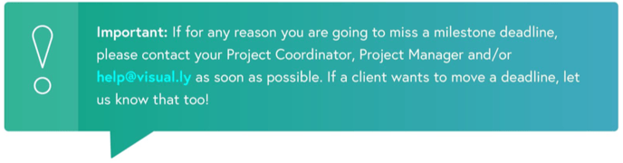
Timelines are critical and they reflect the client’s expectations. Unless the whole team agrees on a timeline change, assume the due dates are hard deadlines and do your absolute best to meet them, every time. If for any reason you think you might miss a deadline, alert your creative director, project manager/project coordinator, help@rockcontent.com, and the client right away. In emergencies, we can re-assign the project or take other steps to make sure it stays on track.
But remember that, for many projects, these deadlines are not negotiable - the client may have a big launch coming up and they need your project to be ready on time. Please always do everything you can to honour the dates you agreed to at the start of the project. We have taken great care to establish meaningful and appropriate timelines that allow you the time you need to make great work while allowing the client to commission turn-key products.
RUSH PROJECTS
When clients need work quickly, they often initiate a rush on their projects. Rush projects have condensed timelines and often have milestones on weekends. They also come with a higher fee. Please do not ever accept a rush project if you will be unable to meet a milestone. This is extremely important: time is quite literally of the essence when it comes to rush designation. Note: if a client sheds time from their feedback rounds (during the scoping phase) it may shorten the overall project duration, but your turnaround times will still be standard unless otherwise indicated, so this is not considered a rush.
ALWAYS MEET YOUR DEADLINES
This is a deadline-driven industry and sometimes a draft may not be 100% perfect by the time you need to get it in front of the client. Sometimes you’ll still be waiting on feedback, or clarification on a question when the deadline approaches. It’s always better to upload on time with a note about the unresolved points than to wait and hold up your due draft. As long as you are meeting your deadlines, the ball is in the client’s court.
That said, there should never be any blatant errors in your work. Copy, visuals, and formatting should be clean on every draft.
Visually Roles and Communications
Anatomy of a Visually project team
ROLES AND HOW TO WORK TOGETHER
Each member of your team will have a specific role and you will all have to work together to achieve the client’s goals (the total number of team members will depend on the project). Our teams are designed to suit the needs of the project. For design-only projects, you may just be working with a client, a proofreader and a project coordinator. For interactive projects, you may have a large team that includes a creative director, project manager, writer, and developer.
ROLES OF VISUALLY TEAM MEMBERS
- Creative director - The creative director is responsible for developing high-level creative concepts for projects - often for enterprise, retainer-level clients or campaign-oriented work - and for ensuring seamless execution. Expect the creative director to be a collaborator rather than a dictator. It’s important not to over-rely on a creative director or think of them as safety net. It is also important that you engage and work well together toward identifying a good solution for the client. If your project does not include a creative director, you are responsible for conceptualization, brand consistency and meeting the objectives of the project. See details of deliverables for this role.
- Writers - If you are on a project with a writer, they are a great partner for collaborating on strategic creative opportunities, and there is great value in working closely with them during the conceptualization and execution of your project. Your writer will help you communicate a client’s or product’s message in a way that is uniquely fresh, memorable and persuasive, and they can work with you on how to visually emphasize or prioritize content.
- Proofreader - Every project that has copy is assigned a proofreader. This team member is responsible for proofreading your client’s copy throughout the design process, most especially at the very beginning and end of the project. If a writer is on the team, this person will assume all proofreading duties, in most cases.
- Developer - Developers, create and document all project code, including HTML, CSS, javascript, and any necessary server-side software to make designs interactive and functioning products. Interactive projects have time built-in for the designer and developer to collaborate. It is important for the designer to review design drafts as early as possible with their developer to identify red flags in executing the design code, optimize the design, and discuss user experience expectations.
-
Animator - Think of animators as designers that make their creations move. If you are working with an animator, they will help bring design assets (their own or provided) to life on screen through 2D and 3D animation techniques.
-
Project coordinator - These team members are responsible for key high-level activities within the project, including kick-off, keeping the project on track and within scope, managing the timeline and working closely with Visually’s Help team to communicate status and escalate issues. The project coordinator is the backbone of the project, serving and protecting both the talent and the client. They are talent's secret weapon and can keep the designer focused on what they do and love best, while handling most of the administrative duties.
-
Project manager - The project manager will quarterback the project, make sure everyone is working well together, and assist in client management, as well as monitoring scope and timelines. This role is usually an upgrade option for the client for larger campaign projects.
Working well with Visually team members
Visually team members are your collaborators. Treat them with respect and engage them in your creative process to achieve the best results. Often, they can identify roadblocks, errors and scope red flags when you cannot because you are stuck in the weeds. Offer to collaborate at every phase, particularly if you have a writer on your team.
Ask for their insight on the client. If a team member worked with the client before you in a previous milestone or project, they may have some tips on being more effective and the style of communication that worked best with the client.
TEAM INTERACTION CHECKLIST❏ Respect their expertise
❏ Respect their needs and deadlines by being responsive
❏ Collaborate at every opportunity, do not animate in a silo
❏ Ask for their insight on the client. If a team member worked with the client before you in a previous milestone or project, they may have some tips on being more effective and the style of communication that worked best for them.
❏ Be grateful, thankful and polite
❏ Communicate simply and clearly
❏ While humour is appreciated, it is not universal. Remember, our clients and talent are from across the globe.
❏ Edit communications based on our communications checklist (below) and the communications best practices outlined in our Welcome Kit.
CLIENT INTERACTION CHECKLIST
❏ Do not talk down to clients: Never assume a client is not knowledgeable about an industry, skill, subject or channel.❏ On the other hand, do not talk over client’s heads: Never assume the client is familiar with industry- or skill-specific jargon.
❏ Always provide context for your decisions.
❏ Recap previous decision points and key insights in the Activity Feed, including goals and former discussions with the client.>❏ Always copy over chat messages to the Activity Feed if they involve pivotal decisions or feedback. ❏ Be polite, responsive and attentive in all communications.
❏ Edit communications based on our communications checklist (below) and the
communications best practices outlined in our Welcome Kit.
Communications checklist
We walked you through our communications best practices in the Welcome Kit, but here is a checklist for your reference and to reinforce the most important points.
Every member of the team (especially the client) wants your project to go smoothly. And at the core of every one of our most successful projects is clear, effective communication...
SIMPLE COMMUNICATION CHECKLIST
❏ Review for spelling & grammar errors: These things can undermine trust and credibility❏ Review tone and voice: Have you been polite, helpful, friendly, approachable and attentive?
❏ Review for informal language: Remove things like “k. thx!,”“haha,” “LOL” or “gr8.”
❏ Review for intent: Could this be received differently than you intended? If so, try again. ❏ Review for clarity: Does this make sense? If not, revise.
❏ Review for simplicity: Is this overly-complicated? If so, simplify.
❏ Review your channel: Does this need to be in the Activity Feed or via Chat?
❏ Review for context: Does your communication need a recap or context? If so, add one/some. ❏ Be proactive: Is your message facilitating or working to move the project forward?
When it’s all said and done, your communication between your team and clients on our platform should be genuine and authentic. Just be mindful to keep all your communication clear, polite, professional, respectful, positive, and friendly. Excellent communication is critical for your success!
And remember: sometimes phone calls and emails outside of the Workspace are necessary, but it’s important to post a follow-up recap afterward. If your project has an assigned project coordinator or project manager, this is part of their job: they are responsible for scheduling calls, and for recapping. But, if there isn’t a coordinator or PM on your team, recapping becomes your responsibility. When and if the Visually Help team is contacted for support on a project, it’s important that all conversations and decisions are properly documented so that a full picture is available to assess the situation.
If you are unsure if your communications (phone, chat or Activity Feed) are appropriate or may be misunderstood, then that is a sign you should stop and rethink what you are trying to say and try a different approach.
Visually Platform Mechanics Visually Platform: The workspace
The Workspace is the heart of the Visually Platform. It contains everything you need for your project, all in one place.
To refamiliarize yourself with the particulars, please review our Welcome Kit <link>. Here is a brief summary of important functionality.
YOUR WORKSPACE: View of all active assignments.
PROJECT PAGE: Project-level access to assets, documents, milestones, deadlines and team and client communication through messaging and the Activity Feed.
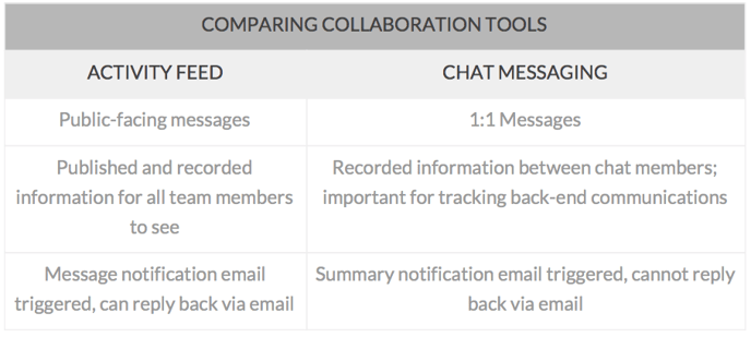
- ACTIVITY FEED: All project activity related to progress, milestones and project feedback that impacts milestones (file uploads, revisions and approvals).
- CHAT: Space for you, your team, and your client to interact more casually about the project. Chat is great for discussing small questions on formatting or design and forgetting minor clarification on feedback. Click here to learn more about our Chat feature. Access from the team members list on the right when you hover over the names.
- TIMELINE & MILESTONES: Lists all milestones, including who is assigned to each one.
- CREATIVE BRIEF TAB: Your project road map - a summary of the project and the client’s goals, along with information about audience, design requirements, style references, and more. Project scope is also included in this section - this is the clear-cut, agreed-upon terms of the project that you are expected to fulfill which will include format, content length, size, design approach or illustration styles.
- FILES TAB: Where you’ll find the client’s materials: copy, design examples, and other documents you’ll need to start your work. It also houses all other file uploads, including design files as the project progresses.
Visually process overview
THE MOST IMPORTANT PARTS FOR DESIGNERS
The Visually Platform process is usually pretty predictable and includes some key instances where the designer drives the project success.
PROCESS
1. Project invitation
a. Reviewing general scope and timeline
2. Accepting a Project
a. Accepting general scope and timeline
a. Detailed creative brief & scope review
i. Identifying red flags and clarifying scope & deliverables
b. Document and asset review
c. Look to see if a kick-off call is required. If there is no CD, PM or PC assigned to the project team, please reach out to the client to schedule a kick-off promptly.
d. Introductions
i. Introduce yourself to the team and client
ii. Briefly reiterate your role in the project
iii. Establish any parameters around availabilities
iv. Establish client's availability and schedule throughout the project
i. Reiterate project goals
ii. Solicit additional assets and information, especially anything that is critically missing like a brand styleguide or logo
i. Recommendations on guiding concept, color, type and layout
ii. Gain consensus
4. Presenting Work
a. First draft
b. Iteration
c. Final draft
5. Delivery of final art/product and related assets (fonts, etc.)
6. Project feedback
7. Payment
The creative brief will include important information about your project: a summary of the project’s objectives and scope, details on the project’s audience and examples of styles and tones that will inform your approach. Read this closely and make notes about anything that seems confusing or open to interpretation.
This checklist will help you ensure you have all the information you need to have a productive kick-off call, or to get started on your first draft:
GENERAL SPECIFICATION CHECKLIST
❏ Do you understand the product’s end-use case?
❏ How and when will this product be used?
❏ Where will the product reside: Print or on-screen? Both? (This will indicate DPI and other file parameters.)
❏ Does the content provided align with the scope of work?
❏ Review the amount of content for the project and compare it to how and where the client intends to use the product. If it aligns with the default scope (more or less) you should move forward. If not, you should flag the project as soon as possible.
❏ Must this project be designed using a designated program or version?
❏ Can you use any program to make your design or are there specifications
restricting what type of program you design in? It’s important that you
verify with your client, unless this has been outlined in the creative brief.
❏ Do you know how the client needs the final file formatted?
❏ If it is being published on social media, you should make sure the size is appropriate for the destined channel.
❏ If your piece will be printed, you should make sure it will work within the client’s printing parameters, which they should provide.
❏ Have you discussed fonts and photography/imagery expectations with the client?
(The Visually standard is to use web-safe fonts for all interactive projects. If the client has specific needs for a different font, the client should upload those fonts and licenses for you to use. All stock photography should also be provided by the client.)
The creative brief helps drive project expectations to specified deliverables and goals. Think through the design process and see if you have everything you need to meet the desired objectives. Once you have confirmed the fundamentals, it’s not uncommon to need to clarify or build upon the information you have.
A good question to ask yourself is: Do you have enough information to provide a recommendation for a guiding concept, layout, type, colour and images/illustrations that can be supported by the creative brief?
● If no, you should gather more information from the client and then work through your recommendations together. A brief that does not provide enough information is a sign the client is unsure of what they want or too busy to clarify. In either case, focused collaboration can clarify goals and help ensure project success.
HOW TO BUILD ON THE CREATIVE BRIEF
● Find tangible examples
○ What examples inspired you or do you admire?○ Can you provide samples or links to these designs?
○ What do you like about them? What do you dislike?
● Explicit needs
○ What things must be present (and how) in this design?○ Is there anything you do NOT want included in your design?
○ Are there any colours to include, adhere to or stay away from?
○ Do you prefer any particular types of fonts like serif or sans-serif?
● Hierarchy
○ What do you think are the most important take-aways of the piece?
● Empathy
○ Tell me about the people who will be viewing or working with this document: who are they, what do they like, and how will they use or interact with the document?
● Lessons, motivation, and team dynamics
○ Have you worked or developed anything similar to this project before? How did it go?
○ What was the impetus for this project? When did you realize you could use this type of piece?
○ What do you hope this piece accomplishes? How would you like the viewers to react? This will prompt client to consider a call to action or parting message.
○ Are you working with an internal team on reviewing this piece? What is your role? What is the workflow for that review process?
Kick-off calls
If your client wants to start the project with a kick-off call, you will see that noted in the creative brief. It’s important to schedule that call as quickly as possible to prevent any project delays. The call is your chance to ask important questions, and to align with the client and creative team on project goals. You may or may not have a project coordinator on your project. If you do, he or she is responsible for getting this call booked. If the client does not want a call, you should ask your questions in the Activity Feed, as promptly as possible.
Don’t forget to check and see if your project requires an official kick-off call! Not all projects require this step, so it is important to check at the onset of the project. This information can be found in the creative brief.
Presenting your work
Before you present work for client review, we recommend that you take the following steps to prepare both your design and presentation:
CLIENT REVIEW CHECKLIST
❏ Review copy for grammar, spelling, kerning and leading errors and inconsistencies. Even though you are a designer, errors in these areas will distract from even the best designs. Edit communications based on the Communications checklist.❏ Make sure you have included all mandatory elements established during the brief and discovery phase and ensure specifications match requirements.
❏ Get any unclear information clarified before posting your first draft.
❏ If any areas of the product are not complete, be prepared to explain these areas to the client and note what needs to be done to finalize them.
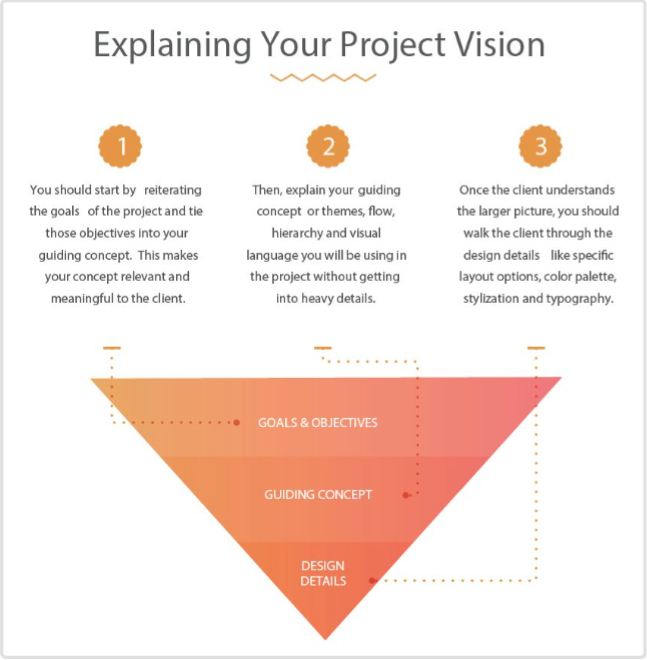
❏ Whether the presentation is through an Activity Feed post or a conference call, walk the client through your vision and interpretation from the beginning of the document to the end and cite key areas for review.
❏ Did you review the creative brief and incorporate any branding, style, voice or other guidelines?
❏ Is this your best work?
File Prep & Organization
HOW TO WORK WITH YOUR FILES TO ENSURE SUCCESS
Your project file and folder should be immediately identifiable and navigable by the Visually team and the client without consultation from you. This means files should be consistently named, folder contents organized and layers and project file components named and organized in the most obvious and sensical way possible. The following contains some of Visually’s best practices and expectations in regards to working with your files, saving and uploading work for the client.
The client has rights to all final files including source documents. For full details on this, please read terms & conditions.
FILE PREP & ORGANIZATION CHECKLIST
❏ Can a client dive into the folder and files and understand the labeling?❏ Do all layers inside files have clear labeling?
❏ Do folders or groupings inside files have clear labeling?
❏ Can a client make edits to a file because all support assets are provided and layers are named clearly?
❏ Are all assets linked properly in the main file build?
❏ Is the project name referenced in the main project folder and the client-facing proofs?
❏ Are all files clear of inappropriate or irrelevant content, communication, images and documents?
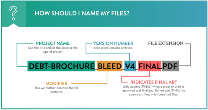
FILE NAMING CONVENTION
INDIVIDUAL FILE ORGANIZATION EXPECTATIONS
Organize and name all layers intuitively. Utilize layer groups and folders within files if appropriate.
TIPS:
-
Put background content in a single folder and/or layer (depending on program) called “background.”
-
Build all illustrations on independent layers and label the layer per illustration element.
-
Put all text on a single layer (Illustrator or InDesign) separate from other elements
-
If designing a long infographic, consider grouping each block into its own folder with various sublayers.
-
At the end of the project, upload the final files and formats and then upload a zip or compressed folder of all project assets for storage to your activity feed.
-
Use versioning for various file revisions.
SOURCE FILES
Providing all source files on design projects is standard as part of every visually project, with a few exceptions. Always glance at the scope of work to confirm. It is important to remember that non-designers, including your client, will eventually have access to all your source files. That means not only organizing and naming files clearly, but ensuring those names are appropriately client-facing and that the contents are clean and clear of any unnecessary work. An example of an inappropriate file name would be:
<databreech_whitepaper_ugly.>
ADA COMPLIANCE
Generally speaking, designers to not need to adhere to any government ADA regulations, but you should be cognizant of the following guidelines for typography, size, contrast and colour, which will improve the general user experience while accommodating users with disabilities or impairments.
GUIDELINES
-
Typography should appear no smaller than 18pt over coloured-backgrounds, 14pt if bold, for ample contrast. If intended for digital formats at 72dpi, should consider 16-18pt type minimums.
-
Avoid using small, thin type over coloured backgrounds.
-
Color contrast between text and background should be evaluated. If in doubt, test
colour contrast of type with this tool.
-
Contrast of text over images can be increased by including a semi-opaque overlay
or gradient.
-
Do not rely on colour alone to classify, differentiate or convey necessary information or changes; colour blind individuals cannot rely on this method. Make sure to use layout, symbols, shapes or type changes in addition to colour.
-
If a document is supposed to be viewable through a screen-reader or comply with accessibility standards, then it is important to include proper document tags and flow information for the reader to interpret. This can be accomplished in PDFs through Adobe Acrobat or InDesign.
ACCESSIBILITY DEFINED
Accessibility traditionally refers t o the design of materials for people with disabilities. The concept of accessible design ensures both "direct access" (i.e. unassisted) and "indirect access" meaning compatibility with a person's assistive technology (for example, computer screen readers).
PHOTOSHOP
Photoshop allows designers to apply alt tags to slices of artwork and export those tags via HTML through the save-for-web-export option. These tags do not carry over to the image unless implemented in HTML.
INDESIGN
InDesign offers a robust set of options for tagging, metadata and flow with the ability to export an accessible PDF or XML file.
ILLUSTRATOR
Adobe Illustrator provides the ability to soft-proof features that simulate color blindness so that a designer can see the impact of the color pallet on those who are color-impaired. Designers can also validate that their design is CUD compliant by viewing a soft proof side by side with original artwork.
Illustrator can also add alt tags to slices of images and export that information as HTML.
ACROBAT
This the most robust platform to ensure accessible documents.See: Accessibility overview from Adobe.
COMPONENTS OF ACCESSIBLE DOCUMENTS
See: Accessibility overview from Adobe.
- All content is accounted for including scanned portions and images. If a PDF is really an image, which cannot be searched but only viewed, you should run Optical Character Recognition (OCR) on the document to identify the text and then embed it for reading by assistive software like on-screen readers.
■ See: Adobe Best Tips for OCR
- Add document properties and metadata such as document title, subject, author, and keywords so that all are considered part of the XMP metadata of the PDF.
■ See: About Adobe Properties and Metadata
- Use Alternative Tags or “alt tags” t o describe all non-text graphics and images, links and form fields in the PDF. Alternative text for any element of a PDF document helps visually impaired readers understand the element.
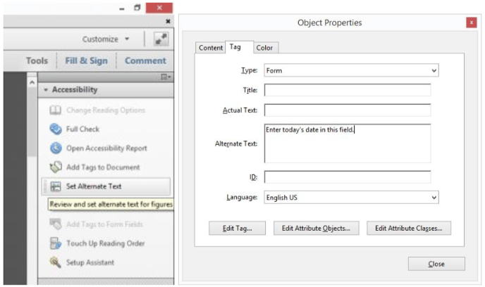
*Images are from Adobe blog
- You can update the flow of the documents through tagging, although this is best handled in a source program where the document was designed - like Adobe InDesign. Once you add tags for major elements including headers, subheads, titles, links and images, you should be able to order how those items are viewed through an on-screen reader.
■ See: Editing Document Structure with Tags
- Use an accessible font (fonts that are commonly available across browsers and operating systems), and limit the number of fonts and font styling (like bold, italics and underlining).
- Run a full Accessibility check by clicking Tools > Accessibility > Full Check. In the Accessibility Checker Options dialog box, select All Pages In Document and click Select All to run checks on the entire document and make any suggested improvements.
■ See: Making and Verify Accessible PDFs in Adobe Acrobat
PROJECT FOLDER ORGANIZATION (suggested)
Project Name
_ArchivedThis is a folder where you can store old versions or files that are no
longer relevant but that you want to keep.
_Assets
FontsAll fonts provided by the client should be stored here.
Supporting artwork
If you have any artwork that is part of the larger project file, consider storing it apart from the main project file in this type of folder.
Provided by client
Any files that were provided to you by the client can be stored in this folder.
Photography
All photography should be placed in a photography folder. Remember, any photos should be provided by the client and have proper licensing.
Documents
Licenses
Content
_Build
This is the main project source file used in the project that references assets in the “_assets” folder.
This is the final, approved project file in its deliverable format for client use as described in the scope of work. Save this in a non-proprietary format such as .PDF, .JPG, .PNG, etc... and include FINAL on the end of the file name. This is not the location of the final project source file.
Proofs
This is where you can record and store client drafts or proofs. Each proof file should have version indicated at the end of the file.
VERSIONING
You are expected to use versioning for saving your files. Do not save over old versions, instead save a new copy for each new file version or revision. You can append “V1”, “V2”, etc. at the end of the file to indicate the version to Visually and the client. If a client approves a version for final formatting, simply append “_FINAL” after the version number in the formatted file (not the source build).
For example, the client has approved your latest file upload: <visually-project_V3.jpg>. You save that file as <visually-project_V3_FINAL.jpg> and keep your source build file name (a photoshop file in this case) <visually-project_V3_.psd>. You would upload the final jpg and upload the zip folder with all project assets including the source file, to the activity feed.
❏ Have you reviewed scope of work, the creative brief and client-provided assets and files, milestones and deadlines?
❏ Have you introduced yourself to the team and client and established expectations?
❏ Have you gotten answers to all of your questions?
❏ Is illustration included? If so, what style?
❏ Where and how is the client going to be using this deliverable?
❏ What formats would the client like the final file in?
❏ Do you have a good understanding of the flow, layout and hierarchy of the information?
❏ Have you determined if the content length is within scope?
❏ Do you know what kind of software the client is comfortable using to help determine what design program you use?
❏ Does there need to be standard information repeated on every graphic like Logo, Hashtag or URL? Does it need to be in placed the same location every time?
❏ For templates, have you determined what program to build the template in and any other restraints added? This should be determined by the program the client will be using to update the template.
Best practices: Infographics
DEFAULT SCOPE, DELIVERABLES, TIPS & TRICKS
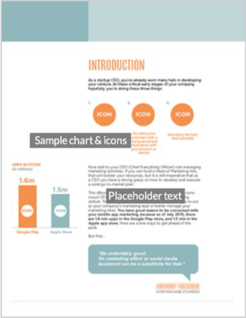
Project overview: Infographics are a powerful combination of story, imagery, and data. Designed to go viral, they capture the essence of a story on one simple, shareable canvas that helps provide an engaging way to relate fact- and data-driven stories.
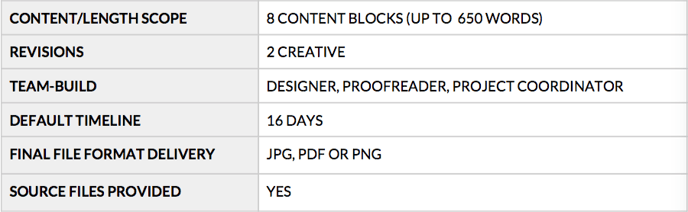
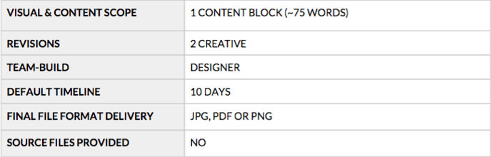
Infographics come in all shapes and sizes and each layout is unique. However, our default deliverable for infographics includes up to eight block units (content blocks) with a header and footer. We define a content block as a “scene” that includes around 75 words and up to one visual, such as a chart, an icon or a spot illustration.
INFOGRAPHIC CHECKLIST
❏ What type of infographic is the client interested in or would work best with the data? (Various types are defined in Special Notes Section)❏ Where and how is the client going to be using the infographic? A blog will require something more compact, while other sites might be able to adapt to a longer graphic. If it is printed, it will be constrained by paper size.
❏ Have you determined how to spread out content among the blocks included in the scope?
❏ Do you know which type of infographic style would work best for the client or does the brief specify?
CHECKPOINTS
- Content Scope: I f the client is packing more than 8 content blocks and content into the design without expanding scope - this is something to flag. Reminder, if a client has a total of 9 or 10 content blocks, that may be considered in the 5-10% scope overage that is acceptable - use your best judgment.
- Legibility: Make sure that you use clear type and sizes throughout the graphic. If you are having to cram excessive text into weird spaces, then explain that content needs to be cut or the size needs to fluctuate.
- Mobile: Check for mobile usage because this will impact your layout and design.
SPECIAL NOTES
- Illustration: Make sure you do not include illustrative elements outside of simple charts, shapes, icons or small spot illustrations without having illustration in the scope. Illustration is not included unless specified.
- Examples of Infographic Types:
○ Simple flowchart, process or sequence - An infographic that uses steps or a sequence of events to explain a process.
○ InfoArticle - This is an infographic form of an article which has visual elements related to specific call-outs, quotes or data within the article. These usually have more text than a generic infographic. Can be formatted to present a list of factoids.
○ Simple explainer diagram - These usually have a single photo or visual with text to explain the visual that can be read in any order. Could even be an org. chart.
○ Timeline - An infographic that presents sequence of events or figures over a span of time, taking a user on a linear journey. These usually cover a segment of time with a specific start point and end point.
○ Comparison - An infographic that directly compares/contrast things; think “this vs. that” or “which is better?”
○ Numbers crunch - These are infographics that explain relationships of numbers. If these numbers are detailed or in a large quantity, this could bleed into a data visualization.
○ Spec or profile sheet - These are infographics that include what would be called “useful” information on a specific topic or skill like specifications, size, tools, etc.
○ Activity - Shows what parts or activities are part of a larger event or product.
○ Locator - Simpler map-driven graphics can be informational without being too data-heavy.
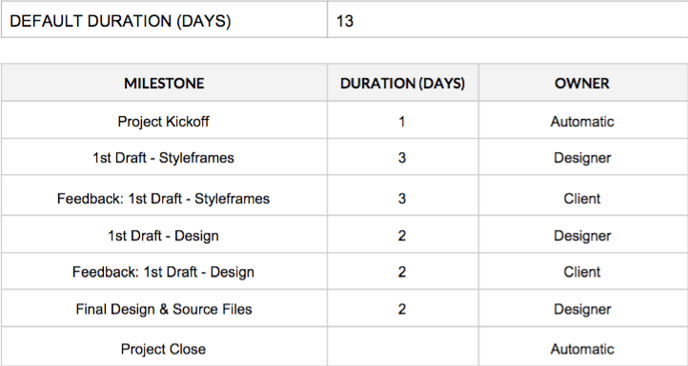
DEFAULT SCOPE & DELIVERABLES
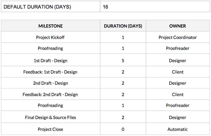
MILESTONES & OWNERS
Please be sure to provide each of your drafts in both PDF and jpg/png format as you work through the revision rounds. The editable PDF will make it easier for the client to mark feedback and notes and consolidate their input for you; the jpg/png will confirm proper size and specs early on.
Best practices: eBooks
DEFAULT SCOPE, DELIVERABLES, TIPS & TRICKS
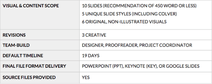
Project overview: e Books are longer form, narrative-driven documents. Unless otherwise specified in the project scope, our eBooks do not need to be responsive or tablet-ready. Our job is to set them up as PDFs and let our clients distribute them from there. eBooks usually include a cover and several pages of content including simple icon and data elements. Other related products that fit into this category are white papers and quarterly reports.
eBOOK CHECKLIST
❏ Do you know what type of layout would work best for the client and end-user or does the brief specify?
❏ Do you know if it will be viewed only digitally or printed? Would the printed version be printed in spreads or single pages?
CHECKPOINTS
- Type: Using a font the client has access to is very important but can severely limit your design. Think about alternative suggestions if you find this challenge on your project.
-
Legibility: Make sure that you use clear type, leading and sizes throughout the graphic. If you are having to cram excessive text into weird spaces, then explain content needs to be cut or the size needs to fluctuate.
-
Content/Messaging: If you feel like the content provided by the client is not meeting their needs, discuss the need to bring on a writer to help with messaging or content development.
- Styleframe: For eBooks, a single styleframe is included in the default scope so that a visual language may be established, reviewed and approved by the client. The approved style may be applied throughout the remainder of the project for consistency and efficiency. The first draft will include all slides based on the approved style set forth in the approved styleframe.
- Open-Source Type: Unless you and the client have agreed that type will be embedded and non-editable, use a pre-approved open-source typeface that the client can implement on their own system. Discuss any non-standard font use with the client prior to design. It is important to use a font the client can load on their own computer to make updates. Please make sure they acquire any non-open-source fonts and provide them to you along with license documentation. Remember: it is not in Visually scope to purchase fonts on behalf of clients.
- Editability: All type should be editable unless discussed previously with the client.
- Illustration: Make sure you do not include illustrative elements outside of simple charts, shapes and icons without having illustration in the scope.
DEFAULT SCOPE & DELIVERABLES
MILESTONES & OWNERS
Best Practices: eBooks Template
DEFAULT SCOPE, DELIVERABLES, TIPS & TRICKS
Project overview: For eBook template s we just design the structure of the document - we do not work with the content. eBook templates usually include a cover, page styles (such as layouts that include images), headers, bullets, and any custom default visuals.
eBOOK TEMPLATE CHECKLIST
❏ Have you determined what types of page types are needed for the client?❏ Do you know what type of layout would work best for the client and end-user or
does the brief specify?❏ Do you know if it will be viewed only digitally or printed? Would the printed version be printed in spreads or single pages?
Type: Using a font the client has access to is very important but can severely limit your design. Think about alternative suggestions if you encounter this challenge.
Legibility: Make sure that you use clear type, leading and sizes throughout the graphic. If you are having to cram excessive text into weird spaces, then explain content needs to be cut or the size needs to fluctuate.
SPECIAL NOTES
- Styleframe: For eBook templates, a single styleframe is included in the default scope so that a visual language may be established, reviewed and approved by the client. The approved style may be applied throughout the remainder of the project for consistency and efficiency. The first draft will include all slides based on the approved style set forth in the approved styleframe.
- Open-Source Type: Unless you and the client have agreed that type will be embedded and non-editable, use a pre-approved open-source typeface that the client can implement on their own system. Discuss any non-standard font use with the client prior to design. It is important to use a font the client can load on their own computer to make updates. Please make sure they acquire any non-open-source fonts and provide them to you along with license documentation. Remember: it is not in Visually scope to purchase fonts on behalf of clients.
-
Editability: All type should be editable unless discussed previously with the client.
-
Illustration: Make sure you do not include illustrative elements outside of simple charts, shapes and icons without having illustration in the scope.
DEFAULT SCOPE & DELIVERABLES
MILESTONES & OWNERS
Best Practices: Presentation
DEFAULT SCOPE, DELIVERABLES, TIPS & TRICKS
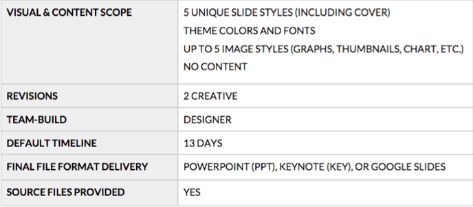
Project overview: Visually offers high-impact presentations through Keynote, Powerpoint or Google Slides. These presentations include various slide designs to help provide variation. When clients need a highly-customized and detailed presentations that will not need any sort of updating, we provide a final presentation document with content built-in.
PRESENTATION CHECKLIST
❏ Have you determined what types of slide styles are needed for the client?❏ Does there need to be standard information repeated on every slide like Title,
Logo, Date. Slide Number, URL?❏ Is the client able to install fonts on their system?
❏ Does the client need to be able to edit any or all slides within the presentation
software in the future?❏ Does the client have a specific typeface that is not open-source they need to use
for branding? If so, they need to upload the font and license for your use.
CHECKPOINTS
- Client Software: Check with the client about the software programs (and their versions) they operate and make sure you can accommodate their needs. This may require saving in a legacy format or updating your software.
- Editability: All elements (type, charts, graphs and headers, etc...) should be editable. Some types of design might require work outside the presentation program. This is okay if the client approves it in advance and understands the consequences.
- Approach: Get documented sign-off and agreement on the program to use, how the design and elements will be built and what elements require editability in-program.
SPECIAL NOTES
- Styleframe: For presentations, a single styleframe is included in the default scope so that a visual language may be established, reviewed and approved by the client. The approved style may be applied throughout the remainder of the project for consistency and efficiency. The first draft will include all slides based on the approved style set forth in the approved styleframe.
- Non-native art/design: If a client wants a design that is not executable within the presentation program itself, make sure the client understands the limits this will place on their ability to update content.
-
Open-source type: Unless you and the client have agreed otherwise, use a pre-approved, open-source typeface that the client will be able to implement on their own system. Discuss any non-standard font use with the client prior to design. It is important to use a font the client can load on their own computer so they can make updates. If a client is requiring non-open-source fonts as part of their presentation, please make sure they acquire these fonts and provide them to you along with license documentation. Remember, it is not in Visually scope to purchase fonts on behalf of clients. Using a font the client has access to is very important but can severely limit your design.
-
Editability: All elements (type, charts, graphs and headers, etc...) should be editable unless discussed previously with the client. Some types of design might require work outside the presentation program. Use other programs to develop design the client is requesting only as a last resort. If you intend to design outside of native programs like Powerpoint or Keynote, you should discuss this with the client prior to design.
-
Illustration: Illustration is not included unless specified.
-
Animation: Animation (transition and element) is not included in default scope.
PREZI BEST PRACTICES
When Prezi is purchased as an add-on to presentations, here are some best practices to follow:
- Prezi is best used when your presentation is viewed with an internet connection (or the downloaded Prezi app) and includes a diverse mix of text, photo and video.
- If the presentation is text-heavy, consider how the content may be broken up into various sub-slides.
- Storyboard your presentation as a rough draft (perhaps just blank shapes with titles) to see how the information and story builds.
- Since Prezi uses vector scaling, do not be afraid to use large and small components to add drama to your presentation (scaling and zooming).
- Using photos and videos is always helpful, but note that zooming into a photo beyond its original size is discouraged, since it will pixelate. Always try and use high-resolution images (300 dpi or higher) to minimize the chances of pixilation.
- Avoid “Prezi Sickness” which is caused by putting all your content far away from each other or including copious rotations in a short amount of time. Use big rotations and pans as transitional elements between sections, rather than micro-components of a “slide.” Opt for gentle linear movement or item-to-item animation if needed.
-
Utilize Hidden Frames to reduce the amount of the clutter present at one time on screen.
-
If you use non-standard type, it will need to be embedded as a vector image and will not be editable in the Prezi software. The same goes for vector images. Be mindful of how your client will be making edits in the future.
MILESTONES & OWNERS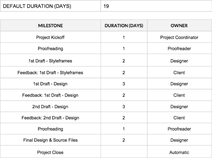
Best Practices: Presentation Template
DEFAULT SCOPE, DELIVERABLES, TIPS & TRICKS
Project overview: Visually offers high-impact presentations through Keynote, Powerpoint or Google Slides. These presentations include various slide designs to help provide variation and flexibility to clients who want to use their template longer term. A template presentation includes master slide styles only - it does not include the content inside them.
PRESENTATION CHECKLIST
❏ Does there need to be standard information repeated on every slide like Title, Logo, Date. Slide Number, URL?
❏ What program would the client like to build their template in? What version of the software are they using?
❏ Is the client able to install fonts on their system?
❏ Does the client have a specific typeface that is not open-source they need to use
for branding? If so, they need to upload the font and license for your use.❏ Does the client understand how Master Slides work and potential limitations?
CHECKPOINTS
-
Client Software: Ask the client which software programs (and versions) they operate and make sure you can accommodate their needs. This may require saving as a legacy format or updating your software.
-
Type: Using a font the client has access to is very important but can severely limit your design.
-
Master Slides: You must employ your design through master slides templates; this is an expectation for all presentation template projects.
-
Editability: Unless previously discussed with the client, all elements (type, charts, graphs and headers, etc...) should be editable. Designing inside presentation programs is challenging and limiting, but can be done with proper planning. You can also identify what parts of the template will not be edited (perhaps a background image) and use those to your advantage to develop outside of the program.
- Approach: Get documented sign-off and agreement on the program to use, how the design and elements will be built and what elements require editability.
- Styleframe: For presentation templates, a single styleframe is included in the default scope so that a visual language may be established, reviewed and approved by the client. The approved style may be applied throughout the remainder of the project for consistency and efficiency. The first draft will include all slides based on the approved style set forth in the approved styleframe.
- Non-native art/design: If a client wants a design that is not executable within the presentation program itself make sure the client understands the limits this will place on their ability to update content and design.
- Open-Source Type: Unless you and the client have agreed to embed non-editable text, use a pre-approved open-source typeface that the client will be able to implement on their own system. Discuss any non-standard font use with the client prior to design. It is important to use a font the client can load on their own computer to make updates. If a client is requiring non-open-source fonts as part of their presentation, please make sure they acquire these fonts and provide them to you along with license documentation. Remember, it is not in Visually scope to purchase fonts on behalf of clients. Using a font the client has access to is very important but can severely limit your design.
- Illustration: Make sure you do not include illustrative elements outside of simple charts, shapes, icons or a small spot illustrations without having illustration in the scope. Illustration is not included unless specified.
DEFAULT SCOPE & DELIVERABLES
MILESTONES & OWNERS
Best Practices: Social Content
DEFAULT SCOPE, DELIVERABLES, TIPS & TRICKS
Project overview: Social content can take many forms at Visually. Typically social content is small and bite-sized. Sometimes it’s referred to as micro content and could be original or derivative. Visuals may be built with illustrations or photos or a hybrid. Sometimes they will include copy. Social content is usually featured in Facebook and Twitter feeds. We deliver a fully actualized and rendered export ready to post on social media.
SOCIAL CONTENT CHECKLIST
❏ Have you determined what platforms the image will be used on to help indicate size and placement specifications? Where will this graphic be living or posted and how will it be used?
❏ Have you tested the final image for proper channel optimization and display?
❏ Will the client be promoting these graphics? (There is a percentage of type to image ratio that must be adhered to for Facebook promoted posts. Check your type to image ratio for Facebook here.)
CHECKPOINTS
-
Type: Using a font the client has access to is very important but can severely limit your design.
-
Type Ratio: If a client plans to promote their social content (like a Facebook graphic), the amount of written content (including a logo) is severely limited. Any graphic with too much type inside it will not be able to be successfully promoted. Check your type to image ratio for Facebook h ere.
-
Readability: Remember that very small type may cause readability issues on-screen.
-
Retina: Design in high-resolution and export to a lower resolution because you cannot upres in the opposite direction. If you are concerned about optimizing for retina viewing, take the standard definition size and multiply each dimension by two to get the retina size.
-
File Size Limit: Ask the client if they have a size limit on their final file.
- Optimization: Final files should be formatted in JPG or PNG and optimized for web browsing. The goal is to make the file size as small as possible without affecting the quality of the image. Pay particular attention to any compression artifacts that may show around typography.
- Specifications: Make sure you reference the most recent specifications for the platform on which the the client wishes to distribute their graphic.
- Open-source type: Unless you and the client have agreed that type will be embedded and non-editable, use a pre-approved, open-source typeface that the client will be able to implement on their own system. Discuss any non-standard font use with the client prior to design. It is important to use a font the client can load on their own computer to make updates. If a client is requiring non-open-source fonts as part of their presentation, please make sure they acquire these fonts and provide them to you along with license documentation. Remember, it is not in Visually scope to purchase fonts on behalf of clients.
- Illustration: Illustration of any kind is not included.
DEFAULT SCOPE & DELIVERABLES
MILESTONES & OWNERS
Please be sure to provide each of your drafts in both PDF and jpg/png format as you work through the revision rounds. The editable PDF will make it easier for the client to mark feedback and notes and consolidate their input for you; the jpg/png will confirm proper size and specs early on.
Best practices: Social content template
DEFAULT SCOPE, DELIVERABLES, TIPS & TRICKS
Project overview: Social content can take many forms at Visually. Typically social content is small and bite-sized. Templates are a good option for clients who have longer-term content plans that are based around key themes. Once finalized, the client will be responsible for updating their template into final content, as needed. This may be text and/or data updates, so it’s important to gather information from the client about how they plan to use their template files. Visuals may be built with illustrations, photos, text, numbers or a hybrid. This type of content is usually featured on Facebook, Twitter and other social feeds, but occasionally might be used for blog thumbnails or other internal digital publications. The template we provide will ensure the proper file set-up and layout and account for various types of content so that the client can change out content as they see fit.
SOCIAL CONTENT CHECKLIST
❏ Have you determined what platforms the image will be used on to help indicate size and placement specifications? Where will this graphic be living or posted and how will it be used?
❏ Have you tested the final image for proper channel optimization and display?
❏ Will you be promoting graphics made with this template?
CHECKPOINTS
- Client Software: How will the client be updating the social graphic templates? Check with the client about which software programs (and their versions) they operate and make sure you can accommodate their needs. This may require saving as a legacy format, updating your software or limiting your work to a specific program.
-
Type: Using a font the client has access to is very important but can severely limit your design.
-
Type Ratio: If a client plans to promote their social content (like a Facebook graphic), the amount of written content (including a logo) is severely limited. Any graphic with too much type inside it will not be able to be successfully promoted. Check your type to image ratio for Facebook h ere.
-
Readability: Remember that very small type may cause readability issues on-screen.
-
Retina: Design in high-resolution and export to a lower resolution because you cannot upres in the opposite direction. If you are concerned about optimizing for retina viewing, take the standard definition size and multiply each dimension by two.
-
File Size Limit: Ask the client if they have a size limit on their final file.
- Optimization: Final files should be formatted in JPG or PNG and optimized for web-browsing. The goal is to make the file size as small as possible without affecting the quality of the image. Pay particular attention to any artifacts that may show around typography.
- Specifications: Make sure you reference the most recent specifications for the platform on which the the client wishes to distribute their graphic.
- Open-Source Type: Unless you and the client have agreed that text will be embedded and non-editable, use a pre-approved open-source typeface that the client will be able to implement on their own system. Discuss any non-standard font use with the client prior to design. It is important to use a font the client can load on their own computer to make updates. If a client is requiring non-open-source fonts as part of their presentation, please make sure they acquire these fonts and provide them to you along with license documentation. Remember, it is not in Visually scope to purchase fonts on behalf of clients.
- Editability: All type should be editable unless discussed previously with the client.
- Illustration: Make sure you do not include illustrative elements outside of simple charts, shapes, icons without having illustration in the scope.
DEFAULT SCOPE & DELIVERABLES
MILESTONES & OWNERS
Please be sure to provide each of your drafts in both PDF and jpg/png format as you work through the revision rounds. The editable PDF will make it easier for the client to mark feedback and notes and consolidate their input for you; the jpg/png will confirm proper size and specs early on.
Best Practices: Iconography, UI
DEFAULT SCOPE, DELIVERABLES, TIPS & TRICKS
Project overview: I conography can appear in many styles. In this case, it is usually a set of icons that represent content or functionality. Icons have less detail than illustrations, work at smaller sizes, and often work in a single color. User interface (or UI) icons are typically standardized (home icon, email icon, etc) and are used for website navigation menus and other actions (like favorite, save, logout, etc.)
UI CHECKLIST
❏ Have you determined the style of the the UI elements?
❏ Have you determined what context the elements will be used on to help indicate
size and placement specifications?❏ Where will these graphics be living? Website? Print? Signage?
❏ How will they be used? To represent content or functionality?
❏ How modern and technologically advanced is your target audience?
❏ What overstates are needed for each icon?
POSSIBLE ROADBLOCKS
- Style: There are many types of icons available, so make sure you set a clear design style and expectation from the beginning. Be consistent in your design approach for the icon set.
- Universal: Icons need to be universally recognized since they lack context and type.
- Vector: Icons are usually built in a vector-based program so that they are easily scaled, used as smart objects or exported as SVGs.
SPECIAL NOTES
- Know the difference: I cons are usually minimalistic in approach, single-colour and stand alone without any sort of explanatory text. Icons usually represent universal actions or ideas.
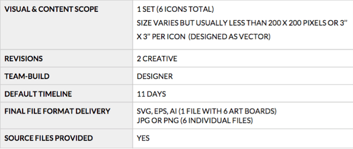
DEFAULT SCOPE & DELIVERABLES

MILESTONES & OWNERS
Best Practices: Iconography, symbol
DEFAULT SCOPE, DELIVERABLES, TIPS & TRICKS
Project overview: Symbol iconography is similar to UI iconography except symbols are often more complex, involve more than one colour and are slightly more detailed in design. However, on a sliding scale of complexity and detail, symbols have less detail than illustrations and work at smaller sizes. Symbols often incorporate several visual elements to create a visual for something more complex like an idea, philosophy, service, process, value or product. Description or summary text may accompany symbols.
UI CHECKLIST
❏ Have you determined what context the symbol will be used in to help indicate size and placement specifications? Where will these be living or posted; how will they be used?
POSSIBLE ROADBLOCKS
-
Style: There are many types of icons available, so make sure you set a clear design style and expectation from the beginning.
-
Vector: Icons are usually built in a vector-based program so that they are easily scaled, used as smart objects or exported as SVGs.
SPECIAL NOTES
- Know the difference: Symbols usually (but not always) employ the use of multiple colours, multiple visual elements and are more visually unique than icons. Often you will see symbols accompanied by explanatory or summary text.
DEFAULT SCOPE & DELIVERABLES
MILESTONES & OWNERS
Best Practices: Logo
DEFAULT SCOPE, DELIVERABLES, TIPS & TRICKS
Project overview: V isually provides a simple and turnkey logo design experience. A logo can be used across multiple platforms, mediums and channels, so it is important to recognize the need for flexibility. A logo is usually built of a single symbol or icon paired with or without a wordmark. Logos can often be type only as well. In simple terms, a logo is the visual face of a brand.
LOGO CHECKLIST
❏ Have you determined the style and colour palette of the the logo❏ Have you asked the client about their competitor landscape? Have you done your research about the industry and brand?
POSSIBLE ROADBLOCKS
- Stakeholder Involvement: Try to align the key stakeholders involved in this process early, given how important a logo often is for a brand. Only two revisions are included, so it is important all stakeholders weigh-in at the right time with feedback and approvals, which includes any initial questions from the designer. Also make sure to know who has the final say in all feedback and approvals.
SPECIAL NOTES
- Style: After your introduction, establish a clear vision of style, color and type for the logo. Send the client a screenshot of your selected colors, type and inspiration.
- Competitor research: A full brand audit and competitor research is not included as a default deliverable. While you won’t be providing findings or a formal audit or analysis, it’s part of your due diligence to look at immediate competitors and the surrounding brand landscape to help inform your concepts and designs. Use your kick-off call or initial discovery phase to surface your client’s competitors and aspirational brands.
DEFAULT SCOPE & DELIVERABLES
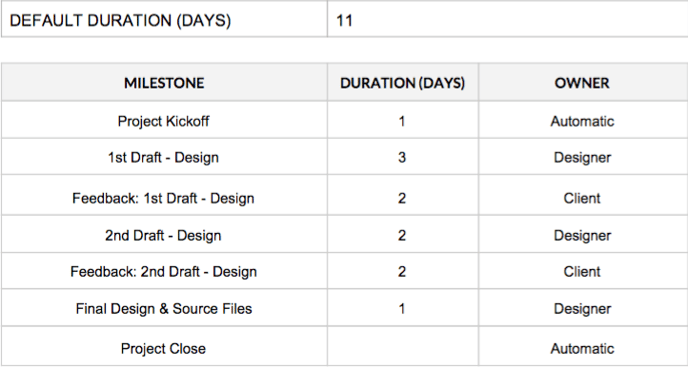
MILESTONES & OWNERS
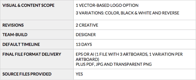
Best Practices: Brand style guide
DEFAULT SCOPE, DELIVERABLES, TIPS & TRICKS
Project overview: Think of a brand style guide as a rule book for how to implement a brand and its elements consistently across applications. It should cover at minimum the logo build, logo variations, type, colour and approved uses/how not to use the logo.
STYLEGUIDE CHECKLIST
❏ Have you reviewed scope of work, the creative brief and client-provided assets and files, milestones and deadlines?
❏ Have you introduced yourself to the team and client and established expectations?❏ Have you asked enough questions? There are some good questions to ask included
below if you need help.-
How will the brand and logo be used? This will determine everything you should include in the guide.
-
Will this style guide need to be printed or will it only be distributed electronically?
-
Are there any size requirements for the final guide?
-
What file type would you like the final file formatted in?
-
Are there any special usages beyond the standard guidelines?
CHECKPOINTS
- Stakeholder Involvement: Try to align the key stakeholders involved in this process early, given how important a logo and styleguide often is for a brand. It is important all stakeholders weigh-in at the right time with feedback and approvals, which includes any initial questions from the designer. Also make sure to know who has the final say in all feedback and approvals.
- Guidance on Guidelines : Sometimes clients do not know what types of guidelines they will need or have a hard time articulating their needs to their designer. Ask plenty of questions to help your client, and rely on style guide best practices.
DEFAULT SCOPE & DELIVERABLES
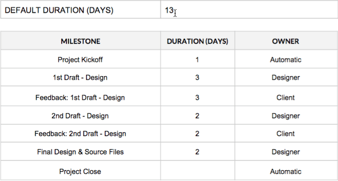
MILESTONES & OWNERS
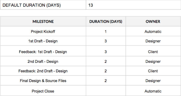
The Creative Director add-on
We’ve been working to better define the value a Creative Director brings to a project. There are probably a lot of reasons why it was not always clear to some clients, but we think it’s mostly because a lot of the work by a CDs can often take place behind the scenes – working with the other creatives to ensure the vision is solid, or reviewing work before it is delivered to the client. A lot of times, these conversations happened in 1:1 chats or even over phone calls, where the client has no visibility.
To alleviate any concerns and enhance the perception, we’ve defined some tangible steps:
Step 1: Open Communications to Reflect Your Contributions
When you are assigned as Creative Director to a Visually project, please remember to post messages in the Activity Feed. This could be a summary of your discussion with the designer, your ideas for edits/enhancements, etc. The goal is to reach a balance – not undermining the designer in the process, but clearly communicating with the client as well about the productive creative process. This is by far the simplest way to help the client see the value provided. Please remember to review all your posts for accuracy in grammar, spelling, etc. Even small typos can really undermine our credibility, especially for senior-level talent.
Step 2: Tangible Deliverables
In addition to better communications, we’ve added some new milestones to project timelines. The milestones are tied to baseline deliverables that come with the add-on of a Creative Director, specifically:
- CD: Written Concepts. This will likely be the first milestone due after the kick-off call. It’s simply an upload of written descriptions for potential concepts. You should work with your designer and writer on these! Here are a couple of examples of what those written concepts might look like:
○ Option 2 - Considering the many options customers have to customize your product, we could showcase this by "building" an order. The simulated purchase would display the product with partial overlays for the options selected. For example, "Choose material" with a pullout that shows an anecdotal description representing a type of consumer and product choice in demand. The colour selector might show “white cotton” for "A.Smith, golf instructor, Florida.” A little below that for “quantity” a pullout could detail “6" as an order size "C.Allen, physical trainer, Texas" would place. This approach will both showcase the options and customization and personally appeal/relate to your customer types.
- CD: ‘1st Draft - Design’ Review; CD: '2nd Draft - Design' Review. We’ll insert these milestones right after the design drafts due, and just before the client’s review step. So you'll officially have a visible review round after the designer posts his/her drafts. Ideally, your posted feedback would be about the overall direction and concept, rather than small edits. If critical edits are needed, by all means include those, but remember to keep feedback actionable and purposeful. Even if you’ve already worked with the designer behind the scenes with some of this feedback, it’s important to post back for the client to see some of the creative process.
SAMPLE TIMELINE:
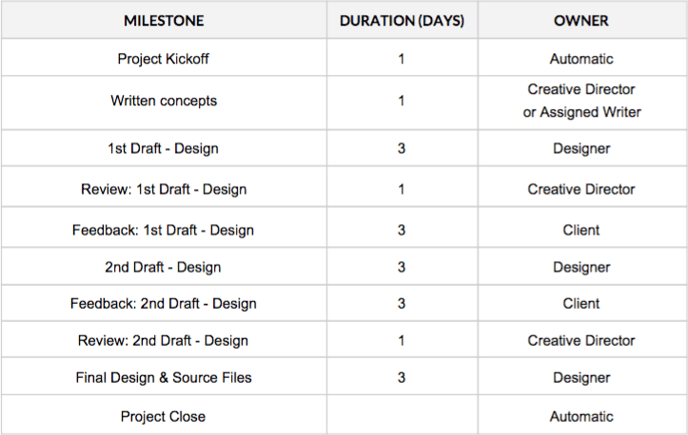
Note: if there is derivative micro content to be done for the project, you’d have a review milestone for this as well – you’ll also be paid more for your time on this type of add-on. You’ll see this type of information in your invite to the project.
The Illustration add-on
By default, all of our design products (e.g., infographics, eBooks, presentations, social content, etc.) are not scoped to include more rigorous and detailed design styles, such as illustration or technical design. These types of styles require an add-on to standard scope. In an effort to simplify the vast world of illustration available to our clients, we have categorized these type of “design upgrades” into the following options:
FLAT
Flat illustrations typically require the least amount of client input to be successful - they do not require realistic images or data. These illustrations have a minimalistic and sometimes abstract quality and do not use extensive detail or shadows for depth. Artwork is solid, clean and crisp. Elements are usually simplified and hyper-realism is avoided for a more computerized/vector style. Flat illustration is also created from a single 2D perspective (front, side, above) and does not employ isometric angle design.
3D

3D illustrations are usually developed as isometric artwork, which could employ a number of styles, including flat colors or hyper-realistic textures. Illustrations developed through 3D computer programs requiring render or export are also included in this illustration category.
INFORMATION DESIGN
While information design is not necessarily always illustrative in nature, it does require more time and is a specific skillset. For that reason, we’ve included this style as an upgrade option. This category requires specific data visualization techniques. While other project types, especially infographics, utilize some elements of information design, they are used sparingly and the amount of data represented is
more simplistic (for example: basic charts and, occasionally, maps). Visualized data could be passively revealing information to readers or actively
leading readers to a conclusion. The style separates itself from standard infographics by leveraging data as the driving narrative, core content and structure, rather than using data as supporting context to emphasize, accent, clarify or decorate the narrative. The entry point for this style category is a moderately complex decision tree or flowchart. These graphics are often used as part of infographics, but in the case of data art, the flow chart is the content.
Data may be visualized through many forms including, but not limited to:
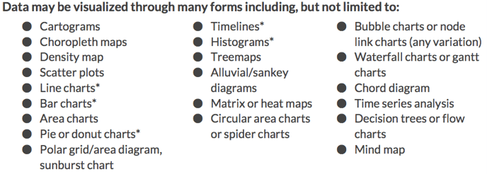
*These types of visualizations may be used in other projects not scoped for data art; however, for those projects, the level of complexity should be significantly less.
TECHNICAL
Illustrations become technical when a precise scale and placement is required for clarity or for explaining a process in which there is no room for interpretation. The architecture, aerospace, energy and medical industries use this style frequently for its attention to detail, realism and accuracy. Technical illustrations are normally accompanied by detailed instructions, notes or in-depth write-ups that explain the illustration. The style of technical illustrations ranges from blueprint-style line work to more hyperrealistic 3D modelling.
CHARACTER
Character illustration focuses on the in-depth development of a single or suite of characters to accompany a campaign, marketing piece or larger illustration. Character illustration either focuses on a single character as the cornerstone of the creative
piece or uses characters to drive the narrative. Characters can be cartoon-inspired, flat or realistic depending on the need. If you need help determining a style or help communicating a style to a client, look at our matrix below. Characters are expected to be fully formed with the proper level of detail to suit the needs of the project.
ILLUSTRATION STYLE MATRIX:
Best Practices: Illustration, Character
DEFAULT SCOPE, DELIVERABLES, TIPS & TRICKS
Project overview: Character illustration can take many forms, but always centres on the form of a detailed single character or a group of characters. This type of illustration focuses on details of the character silhouette to bring its personality to life. A character can be a person or animal (or even an object), as long as embodies your narrative’s personality. Usually a character will illustrate a point, process, personality or activity.
CHARACTER CHECKLIST
❏ Have you determined the style of the character? Consult the illustration matrix (above) if needed.❏ Have you determined what platforms the image will be used on to help indicate size and placement specifications?
❏ Have you established what level of detail you need to execute the character illustration?
SPECIAL NOTES
- Feel free to use our character style matrix to help clients determine the overall look and feel of their desired character illustration.
DEFAULT SCOPE & DELIVERABLES
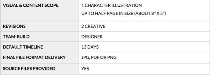
MILESTONES & OWNERS
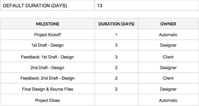
Best practices: Illustration, spot
DEFAULT SCOPE, DELIVERABLES, TIPS & TRICKS
Project overview: A spot illustration covers a smaller portion of a designed document (usually a quarter or half page) and can be about any subject matter in any size. A spot (or object) illustration is a small illustration (usually of a single object) that stands on its own.
For this reason it can often be confused with an icon, but spot illustrations are more illustrative or detailed than simple symbol icons. An animal or person can be a spot illustration, if it’s a simple object (see examples below), rather than a full character illustration.
SPOT ILLUSTRATION CHECKLIST
-
❏ Have you determined the style of the illustration? Consult the illustration matrix (above) if needed.
-
❏ Have you determined what context the image will be used in to help indicate size and placement specifications?
-
❏ Have you established what level of detail you need to execute the illustration?
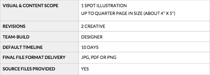
MILESTONES & OWNERS
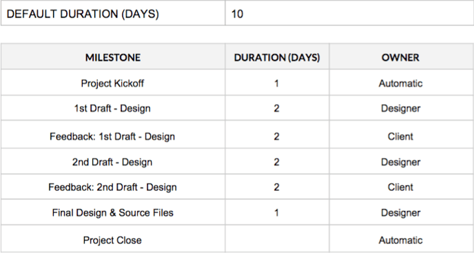
Best Practices: Illustration, scene/header
DEFAULT SCOPE, DELIVERABLES, TIPS & TRICKS
Project overview: A scene (or header) illustration is the most complex illustration we provide. A scene can include a background, multiple objects and/or characters in any type of environment. A scene or header illustration is usually contained within a page. If it is a header illustration, the illustration will be placed before other content and set the tone and style of the rest of the piece. If the illustration is a scene, it can be highly detailed, but does not usually include much type and will take up the full page. A detailed scene can stand alone as an art piece.
SCENE/HEADER ILLUSTRATION CHECKLIST
❏ Have you determined the style of the illustration? Consult the illustration matrix (above) if needed.❏ Have you determined what context the image will be used on to help indicate size and placement specifications?
❏ Have you established what level of detail you need to execute the illustration?
POSSIBLE ROADBLOCKS
- Scope: Make sure the header image does not grow into an infographic. Contain the illustration to a specific size and keep content within the illustration to a minimum.
DEFAULT SCOPE & DELIVERABLES
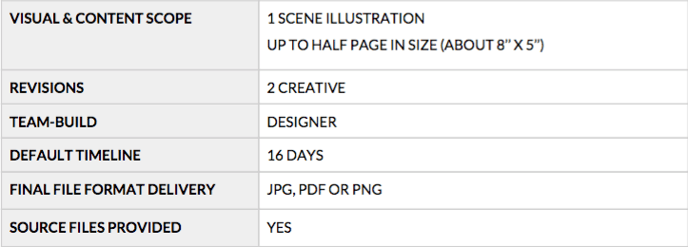
MILESTONES & OWNERS

Your relationship with Visually
We value you and will do everything we can to foster a good, mutually respectful relationship with all of our designers and team members. Sometimes things happen, but we hope you will always feel free to reach out to us with concerns or problems that might affect your work.
Certification
Now that you are certified, you will be looked at for potential work on a regular basis . Our platform is a wonderful place for talent like you to engage in creative collaboration with great clients. We look forward to working with you and introducing you to those clients. Make sure you keep your Visually portfolio updated with your latest and best work. A healthy portfolio should display your range and inspire confidence in a client.
Reassignments
There are many reasons why talent may sometimes be removed from a project, and ultimately it is at the discretion of Visually staff. Some scenarios that often result in removal include, but are not limited to, missing or unresponsive talent; talent that is perpetually late delivering work or completing milestones; unprofessional behavior and/or communications toward clients, team members, or Visually staff; or client complaints that are investigated and deemed warranted by Visually staff. Sometimes, we need to reassign, because it’s just not a great match. Regardless of the reason, if you are removed from a project, you will be notified by Visually staff. An explanation for removal is usually offered but is not required or guaranteed. Our staff will also discuss payment details for the project, which will be based on a number of factors, such as work completed at the time of removal, grounds for removal, and more.
Decertification
Decertification from the Visually Platform can be warranted on several grounds, but as a general rule, is reserved for the most egregious offenses or behaviors that indicate a lack of interest in or engagement with Visually.
Failure to follow any of our terms or policies may lead to automatic decertification; in particular, unprofessional behavior or communications with Visually clients, team members, or staff will be taken very seriously. We maintain a very low- to zero-tolerance policy on this front.
Other actions that could lead to decertification include perpetual rejection of project invites, as well as unsubscribing from our talent email list, as this is one of our core methods of communicating with our large talent pool. Our talent emails include announcements about policy updates, new offerings, payment details and other critical information.
Visually staff does not take decertification lightly. It is within our sole discretion when talent becomes decertified. We usually notify individuals when they become decertified; however, this notification is not always guaranteed, nor is it owed.
Tools & resources
SUPPORT FOR VISUALLY DESIGNERS
Along with our Visually Welcome Kit and Playbooks, we offer several tools to help you with your work on the Platform. Many of our FAQs and training are available at Visually’s Help Desk or in your Workspace. Remember: your Workspace is the the hub of all your Visually projects and the key to your client workflow. If in doubt, start there!
Open a support ticket (this is the fastest way to get help) or ping help@rockcontent.com
ADDITIONAL RESOURCES
Welcome Kit: This is a document that shares overview information on the Visually Platform and general processes for all Visually members. Learn about basic expectations and workflow here.
Talent Terms & Conditions Your terms and conditions for working with Visually.
Policies If you are fuzzy on our policies or need clarification, visit our policies page for more information.
Project Portfolio See samples from every type of project to get some inspiration or clarification.