.png?height=120&name=rockcontent-branco%20(1).png)
Learn how to use the Reveal element to display a dropdown tab
The Reveal component is used to show content when someone clicks or hovers over some other piece of content. Often-times, Reveals are used to add interactivity in the middle of the page but can also be used to create dropdown menus for navigation.
Before we begin, you will want to have an understanding of how to work with the Reveal component. For details on how to work with the Reveal component, click here.
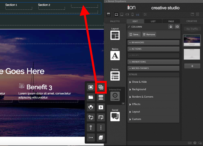
To set up dropdown navigation, drag the Reveal component into a column or container.
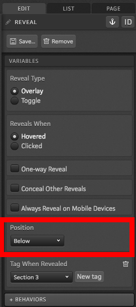
Your Reveal will be set up to show the Reveal Container on hover by default. To make the links show below your main tab, update the “Position” setting to “Below.” You’ll also likely want to apply a tag to your Reveal to see how many respondents interact with it.
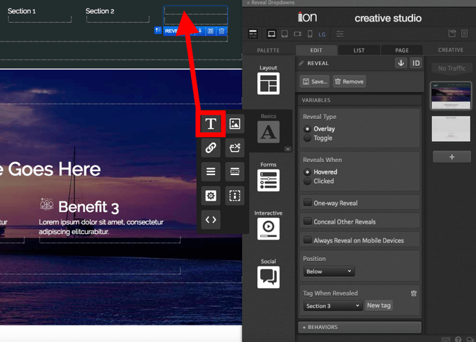
Next, add text to the Reveal Trigger. This will serve as the tab your respondents will hover over to view the dropdown navigation links.
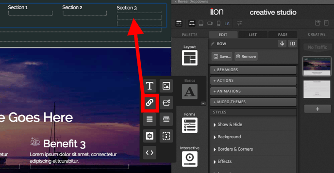
Finally, add links to the Reveal Container that you want to show respondents when they hover over the tab.
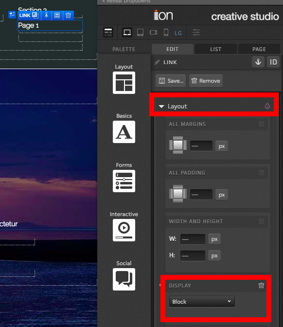
After adding each link, you will want to navigate into the Layout styling section of your creative studio and choose the “Block” option from the “Display” dropdown to make your links stack on top of each other instead of rendering next to each other.
Once you're all done, you will be able to see your dropdown nav in action by previewing the page and hovering over the tab.
If you have any questions, please contact us on help@rockcontent.com. 😀