.png?height=120&name=rockcontent-branco%20(1).png)
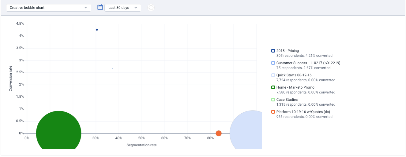
Creative Bubble Chart
The creative bubble chart shows the top performing creatives within a campaign. The larger the bubble, the more traffic it’s received, and the best performing paths will be closest to the top right corner. To view more performance details from any of these paths, just click on the bubble or in the key at the right. You will also find a key to the right that shows which bubbles belong to which campaigns as well as the total respondents and conversion rate for that campaign within the set time period.
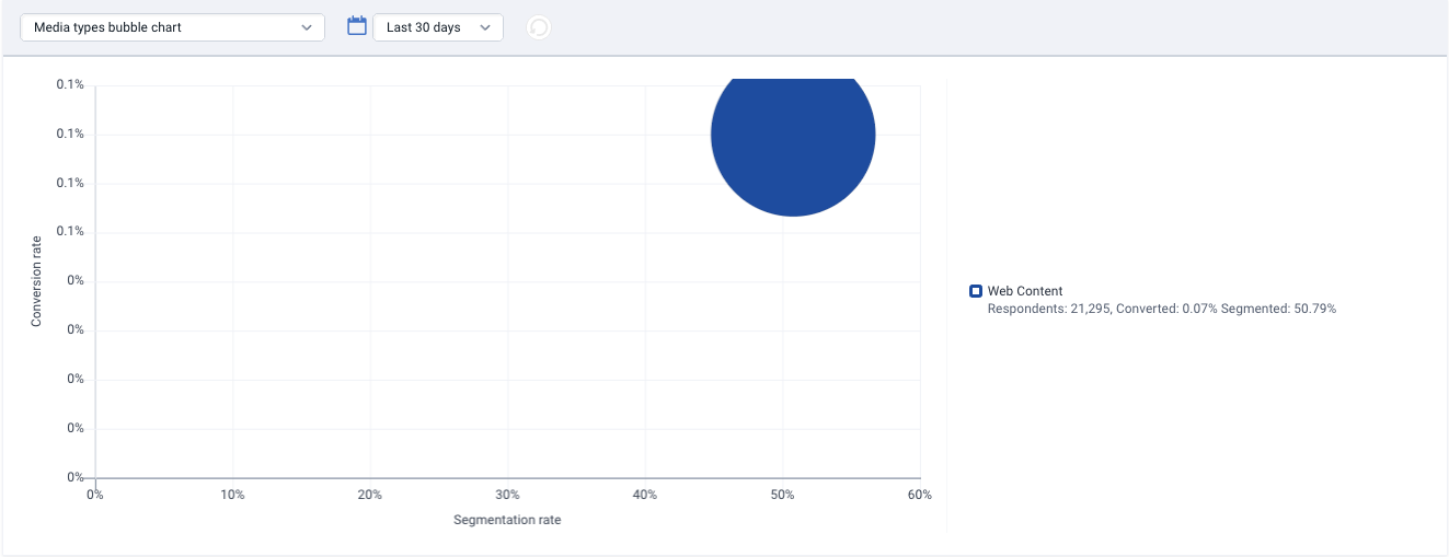
Media Types Bubble Chart
Media types bubble chart shows the top performing media types (e.g., email, banner, search engine) in the campaign. The larger the bubble, the more traffic it’s received, and the best performing media types will be closest to the top right corner. The media types bubble chart is a great place to check how well your types of traffic are performing in relation to each other. With the segmentation rate on the x-axis and the conversion rate on the y-axis, bubbles that trend toward the top right corner are performing better than those bubbles in the lower left-hand corner. You will also find a key to the right to see which color corresponds to which bubble as well as the total respondents, conversion rate and segmentation rate for each media type.
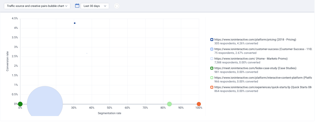
URL & Creative Pairs Bubble Chart
The traffic source & creative pairs bubble chart shows the top performing traffic sources in the campaign and notes the top performing creative in each traffic source. The larger the bubble, the more traffic it’s received, and the best performing traffic sources will be closest to the top right corner. You will also find a key on the right that shows which color corresponds to which creative as well as the total respondents and conversion rate for each creative.
If you have any questions, please contact us on help@rockcontent.com. 😀