.png?height=120&name=rockcontent-branco%20(1).png)
The Ion platform can be used to create & launch responsive pages that look great on desktop, mobile and tablet devices!
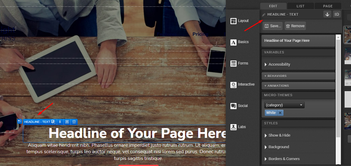
Introduction
Ion interactive provides some of the most sophisticated responsive design flexibility and features available, and these are best leveraged once you have learned about the fundamentals of responsive layouts — these fundamentals are not specific to the Ion platform, but are general responsive web design principles. Before creating your first Ion responsive pages, we recommend self-study on how responsive design works. We’ve compiled a few of our favorite third-party resources to help you:
- The seminal responsive design article was published by Ethan Marcotte in May 2010, and we recommend starting with it.
- Responsive web design (RWD) is a web design approach aimed at crafting [experiences] to provide an optimal viewing experience — easy reading and navigation with a minimum of resizing, panning, and scrolling — across a wide range of devices (from mobile phones to desktop computer monitors).
- To see responsive design in action, here’s an article showing 50 examples from around the web.
- Your Ion interactive platform uses the bootstrap grid for page layout. This is a common grid structure used by many responsive websites.
Guidelines for Responsive Design Mockups
We hope that designing experiences in the Ion platform is so flexible that you no longer need to make page mockups outside of the platform. We recommend a creation-first approach where the page is brought to life right within the Ion platform. However, if your process requires you start with mockups (typically made in Photoshop) before publishing in the Ion platform, then it is very important that you read our bootstrap grid support post which includes PSDs for the bootstrap grid. For PSDs that will help you get started with the bootstrap grid, click here.
Other things to keep in mind
- IE8 and earlier versions of Internet Explorer do not support responsive design.
- Ion pages will render in medium viewport for visitors who view a responsive page in IE8 or earlier.
- For statistics on Internet Explorer usage, click here .
Introductory Design Principles
- Your images may change size depending on the screen size being used. Larger images retain image quality when they shrink. However, smaller images tend to become pixelated when they are enlarged. With this in mind, it is recommended that you use larger images to ensure the best possible quality of your images.
- When making adjustments to content on your page, define your adjustments in percentages or em instead of pixels so that your changes are made relative to the width of your page/column as opposed to making adjustments in fixed units of measure. This will help retain the flexibility of responsive design while allowing you to make adjustments that are consistent across different screen sizes.
- It is specifically recommended that you use "em" for font size, padding and margins and "Percentages" when defining widths.
- Different browsers will render your adjustments differently. With this in mind, should you make adjustments to your pages, we would highly recommend browser testing thoroughly to ensure that your page renders well across different browsers and devices.
- If you are a developer, it is recommended to not create classes with fixed widths as this will have a negative impact on the responsiveness of your page.
- Designing your pages for mobile first is a great way to help find what is most important within your experience. It also tends to be easier to expand outward from a small space as opposed to trying to condense a large web page into a smaller, mobile space. For more information on the “mobile first” philosophy, you may want to read “Mobile First” by Jeffrey Zeldman .
- Although starting by mobiles can help you focus on the important elements of the experience, we recommend that our clients start creating section by section in desktop view (LG) and adapt each one for every viewport before moving to the next section.
- We also recommend naming Containers accordingly:
Before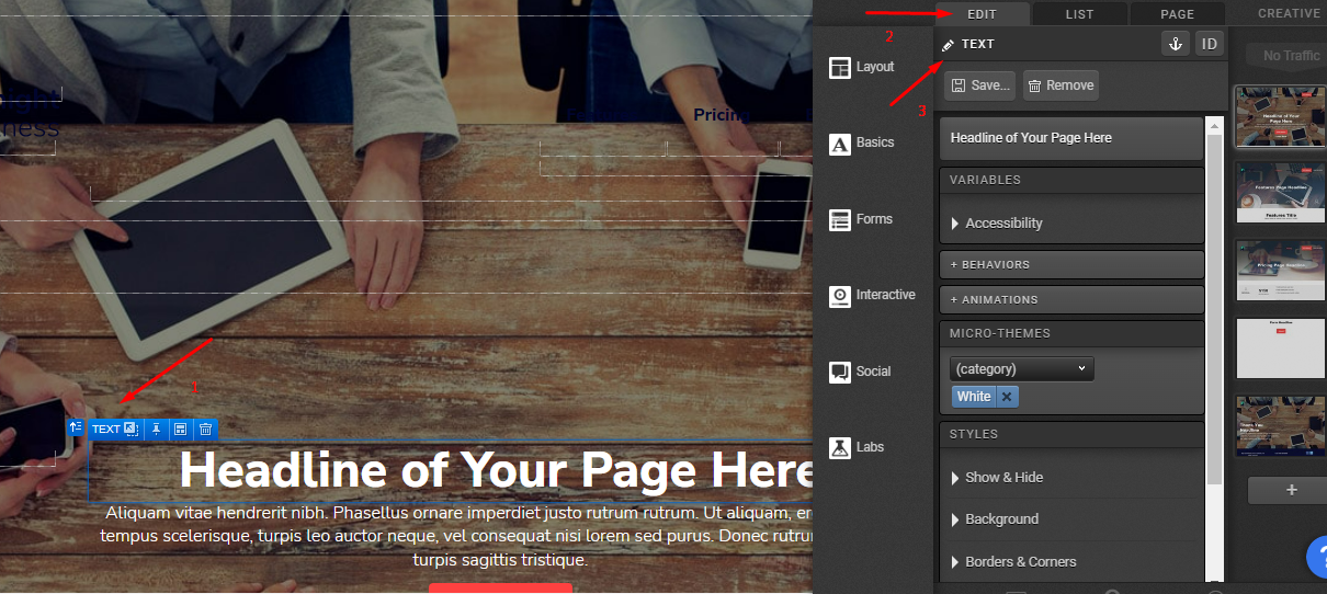
After